August 15, 2021
#stayhomebewell
I feel like I’m basically done. Please go back and look at the archives of this blog, to see what I was writing over a year ago. Everything has played out pretty much exactly as I had projected. I begged and prayed to be wrong then. But the data analyst in me still wants to keep an eye on the situation and keeps updating the dashboard to see what story the numbers are telling. There are thousands of sources of information now that are analyzing this data a hundred ways from Sunday, with people who are much more capable than I am, so there’s no more need for me to continue with this. However, in many respects, I do still feel that the particular metrics I’ve come to settle on, and the way I am presenting them graphically, really do tell the story very succinctly.
So here’s another, and possibly, final, update.
The graph below contains too much information, I know. I’ll explain it in prose.
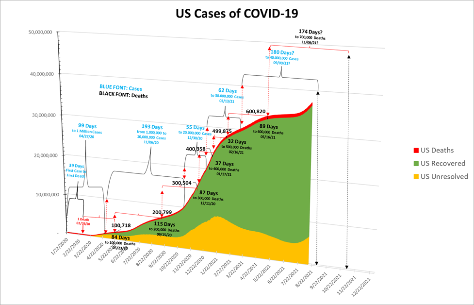
From the outset of this pandemic, I’ve been unsatisfied with the information that the news has been providing. In the beginning, I felt like they weren’t even asking the right questions, let alone answering them. So I’ve been taking the three relevant numbers of Total Cases, Deaths, and Recoveries and extrapolating from them the numbers of new cases, deaths, and recoveries, and the number of unresolved (currently infected) cases, calculating the rates of change, and looking at the ratios of each of those figures relative to one another. Much of this seems old hat now, but nobody I had found was doing it at the beginning.
I then chose to look at how long it took to reach certain milestone numbers, or for the U.S. numbers to match the numbers in the rest of the world, in order to use what I called a “triangulation” method to predict when the U.S. would hit the next milestone number. In some cases, I was off, sometimes by a little, and sometimes by a lot. Most of the time, though, I hit the nail pretty close to on the head. The archives of this blog are a record, in case anyone wants to check.
So. What is the graph above telling us?
U.S. Cases: The first U.S. case was recorded on January 21. (The worldometers.info website starts its global data set from January 22, even though it also reports that the first case in the U.S. was detected on January 21. I have used that as my data source, and I don’t care enough at this point to modify all of the graphs I’ve made to analyze everything, which number probably around 70 or 80.)
The time from the first case to the first death was 39 days. (If I moved everything back one day, it would recall the biblical 40 days, which would be poetic. See https://stayhomebewell.org/2020-07-26/, https://stayhomebewell.org/2020-08-15/, https://stayhomebewell.org/2020-12-05/, https://stayhomebewell.org/2021-01-10/, and particularly https://stayhomebewell.org/2021-01-13/.
It took 99 days to go from one case to one million cases (recorded, anyway), on April 27, 2020.
It then took 193 days to go from one million to ten million cases on November 6, 2020.
Let that sink in.
The infection increased nine-fold, from one million to ten million, in only twice the time it took to go from one to one million.
The next ten million cases took only 55 days. Ten million cases in 55 days.
So, from one case to ten million cases in 292 days; but the next ten million took 55 days, or less than one-fifth the time the first ten million took.
From twenty million to thirty million on March 13, 2021 took 62 days.
We are currently at 37.4 million cases in the United States. The number of daily new cases is rising quickly again. The daily average over the last week has been 129,000; over the last 14 days has been 118,000; over the last 21 days has been 105,000; and over the last 28 days has been 91,000. Assuming, unrealistically conservatively, that the new daily case rate does not even continue to grow, the calculation of when we will hit the forty million mark is as follows:
40,000,000 (projected) – 37,435,835 (current) = 2,564,165 (difference).
2,564,165 (the gap) / 100,000 (a CONSERVATIVE estimate for daily new cases) = 25.6 days from now.
August 15, 2021 + 25 days = September 9, 2021.
Thirty million cases on March 13, 2021 to forty million cases on September 9, 2021 = 180 days.
U.S. Deaths:
As noted, it was 39 days (and perhaps actually a biblical 40) from the first case to the first death on February 29, 2020.
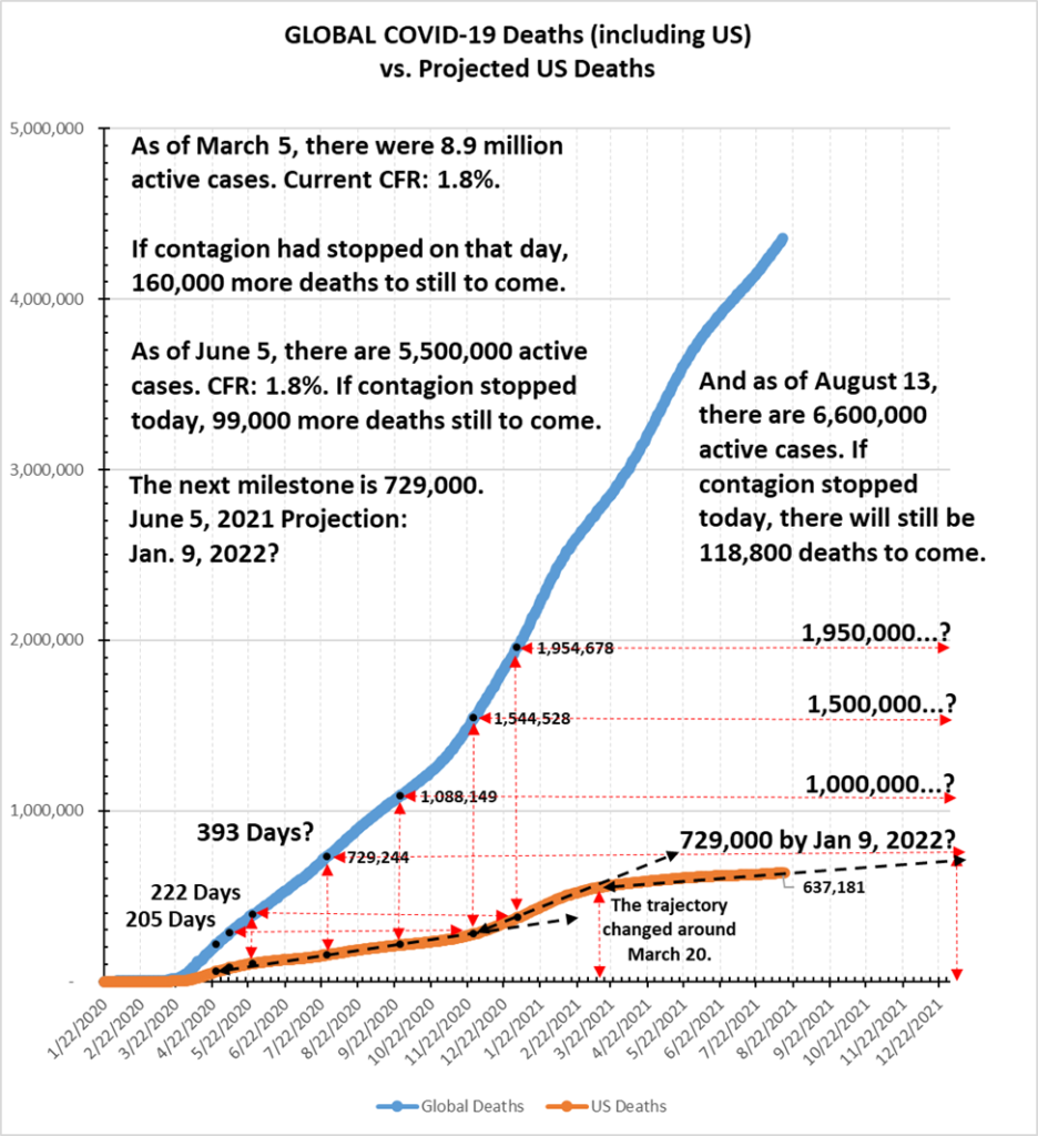
It then took 84 days to reach 100,000 deaths on May 23, 2020.
From there, another 115 days to reach 200,000 deaths on September 15, 2020.
Eighty-seven more days to 300,000 deaths on December 11, 2020, but only 37 days for the next 100,000 deaths (!!) reaching 400,000 deaths on January 17, 2021. This rate further sped up, taking only 32 days to reach 500,000 on February 16, 2021. Then things slowed significantly, taking 89 days to reach the 600,000 mark.
The average number of daily new deaths over the last week has been 565. Over the last 14 days it has been 529; and over the last 28 days it has been 432. That indicates how the number is growing.
We are currently at 637,439 dead in the United States, according to www.worldometers.info. So, my calculation to predict when we will reach 700,000 is as follows:
700,000 (projected) – 637,439 (current) = 62,561 (difference).
62,561 (the gap) / 750 (a conservative estimate, given current numbers and the speed of growth) = 83 days from now.
August 15, 2021 + 83 days = November 6, 2021.
November 6, 2021 – May 16, 2021 (the date we reached 600,000 deaths) = 174 days.
That’s what the graph is telling us.
There are lots of other ways to look at this data as well.
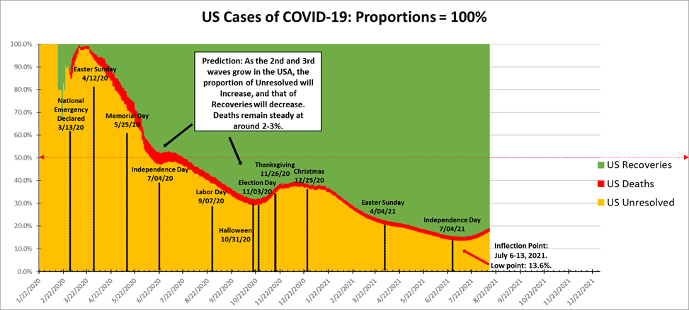
The green represents the portion of U.S. cases that resolved to recoveries; the orange represents the portion that are actively infected at any given point on this timeline; the red represents the portion who have died.
On January 22, 2020, no one who was infected with COVID-19 had had time yet for their case to resolve. There are only two possible resolutions: recovery or death.
As time progressed, most of those actively infected people recovered. Approximately two percent of them died. However, as the earliest infected people either recovered or died, newly infected people added to the pipeline of currently infected, or “unresolved,” cases.
At the start of the pandemic, 100 percent were unresolved. When, if ever, this pandemic ends, 98 percent of the people will have recovered, and 2 percent will have died, and there will be zero percent unresolved, by definition.
What this representation of the data does not show you is the magnitude. For that, you need the first chart, showing that we are approaching 40,000,000 cases and 700,000 dead. What this representation does show you, however, is the ebbing and flowing of the pandemic within the United States. You can also see some of the major dates associated with large gatherings of people, and their temporal relation to those ebbs and flows.
Now, one has to consider that there is always a time lag between an event and its effects. We’ve already discussed the significance of the number forty. There is a lag between, say, an event like a lollapalooza concert and when some portion of those in the mosh pit will check themselves into an emergency room. There is a lag between an event like a Thanksgiving holiday, when people will travel throughout the country to congregate for extended periods of time in enclosed spaces with others from around the country, and the time that they come home to their communities and spend Christmas or New Year’s with a different group of people, and the time that some portion of those people require intubation in intensive care units. And there is a time lag between events like July 4th celebrations at which friends and neighbors gather, admittedly, likely outdoors, and enjoy beers and hotdogs together, and the time when the ratio of unresolved to recovered inflects and changes trajectory, as it did from July 6-13, as notated on the chart.
So, where is this all leading?
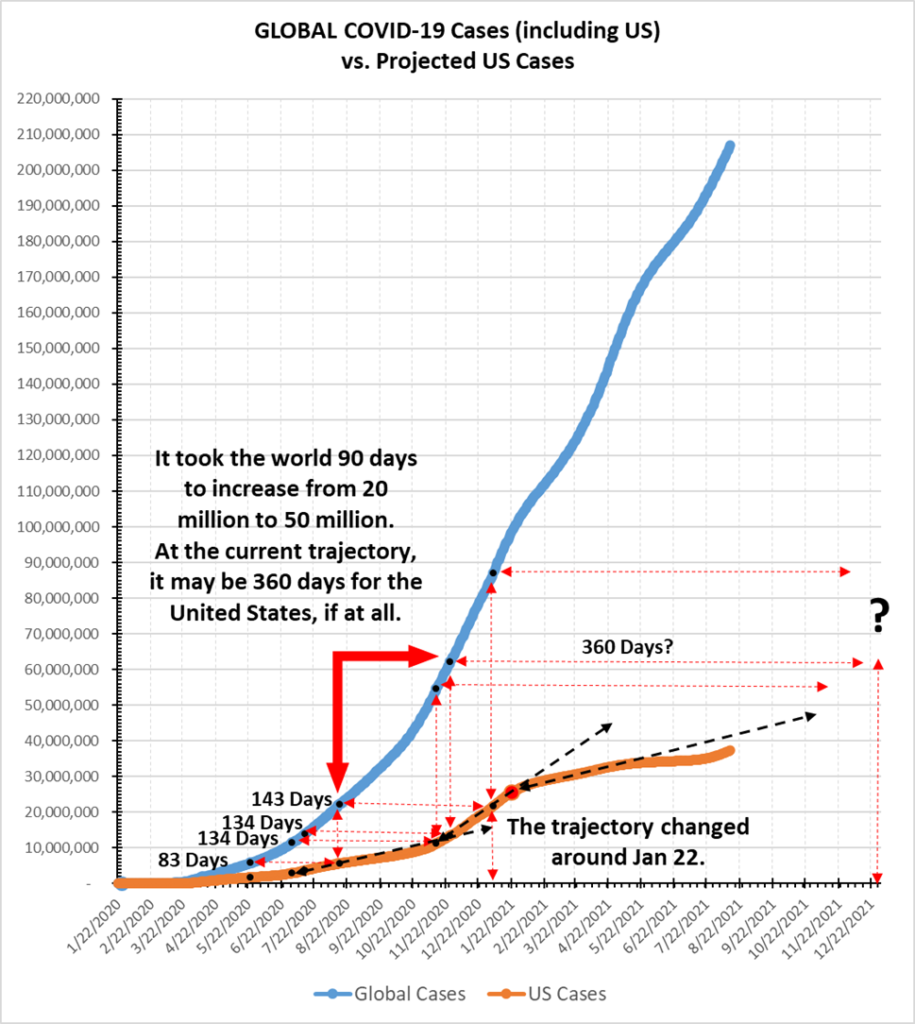
From the inception of this chart back in March 2020, I asked the question: On the date that there were, say, 10,000 infections recorded globally, how many were there in the United States? Then I kept track to see how long it took for the United States to reach that same number. I further then asked, how many infections are there globally on that date? And then I tracked how long it took for the United States to reach that same number. That’s what all of the horizontal and vertical dashed lines with arrowheads in the graph indicate. The establishment of these markers define triangles, from which I made future predictions. While trajectories remained stable, my predictions were spot on. When trajectories deviated from the historical paths they had established, I witnessed those changes in real time. Looking at the chart above, you should be able to see exactly what I’m talking about.
This chart suggests that the trajectory of new cases in the United States, which had begun to flatten significantly right around January 22, is steepening again now. If it maintained the slope that persisted from January 22 to May 22, then we might expect to see a level of 54 million cases around January 22, 2022. Tracing the line of the 40 million mark to where the orange line will likely intersect it, though, points at around September 9, 2021, or twenty five days from now.
A similar look at the deaths yields the following chart:
So, how do we know what will happen? The number of unresolved cases is the real story. I encourage readers to go back through my posts to see what I wrote/predicted previously, given what was known at the time. In this case, you’ll see that my last post was from June 19, 2021, 57 days ago. At that time, the number of unresolved cases was dropping, both in the United States and throughout the world. It was encouraging. At that time, I wrote, “Let us all hope this is truly going to mark the end.”
Here is what it looks like now:
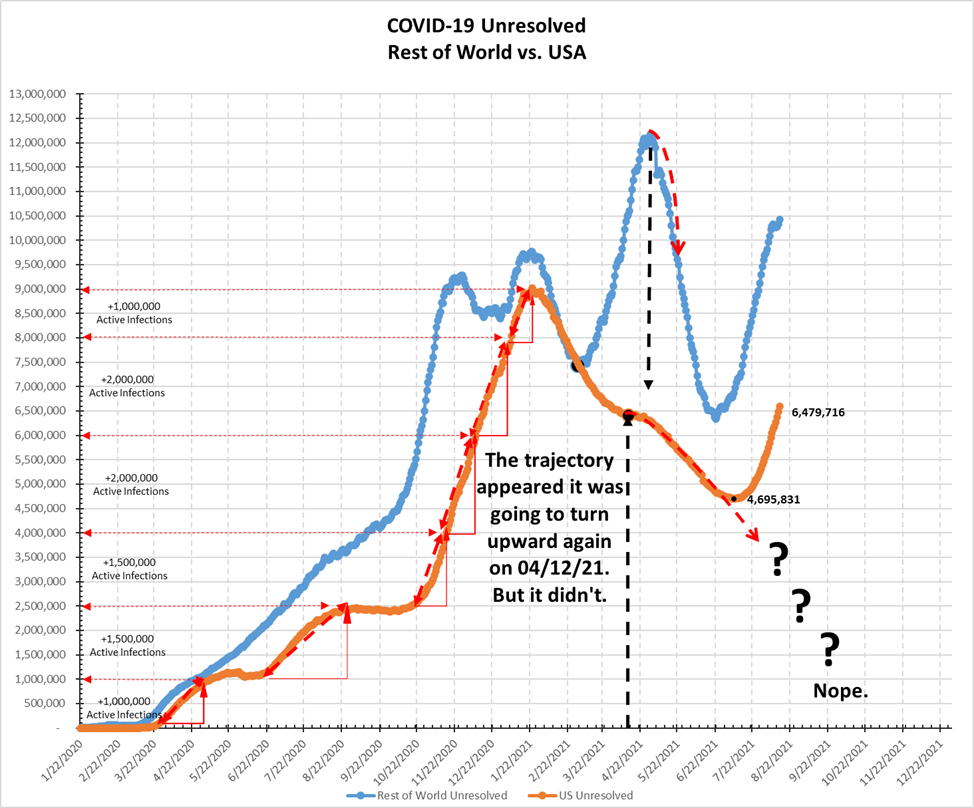
There’s a lot that one could say about all of this. But what’s the point? The horse is already so long out of the barn by now that it is just in the hands of fate now.
My own problem, personally, is that my son is only eleven years old and won’t turn twelve until he will already have been thrust back into the petri dish of his middle school for a full three weeks before I will be able to get him his first vaccination. And then another three weeks until he can get his second dose, and then another two weeks until he will have the full protective benefit of the vaccine.
People don’t read, and they don’t know history. They don’t know Mark Twain, Isaac Asimov, P.T. Barnum, Thomas Paine, or Carl Sagan.
I wrote in April 2020 and it is as true today as it was then: “It’s like there are people standing on railroad tracks with their fingers in their ears and their eyes squeezed shut refusing to listen when we tell them there is a train coming. They say, “What train? What tracks? Fuck you, libtard.” And it wouldn’t matter to me if they got destroyed by that train, except that I know that I’m tethered to them, and when that train smashes them, it’s gonna pull me right into the mayhem.”
This is likely my last post, at least for a long while. Good luck to you all, and thank you to all who have expressed support and solidarity.
