April 4, 2020, 10:45 pm
Click, like, and share #stayhomebewell, www.facebook.com/stayhomebewell, and www.stayhomebewell.org to get the word out to as many people as possible to STAY HOME and BE WELL. See the bottom of the page for the Facebook, Instagram, and Twitter buttons. Please share!
I’ve received a couple of comments from readers that my analysis is too much numbers and that I leave too much of the conclusion-drawing to them, forcing them to make sense of complex charts and graphs, which not everyone knows how to do. I appreciate that feedback and I will state my conclusions more clearly and explicitly from now on.
I have been writing my analysis in the style that I have been partly because I was probably just too much in my own head and was writing for, essentially, myself as the consumer. But I was also trying to keep it as dry and factual as possible in order to avoid the pitfall of being accused of any sort of slant in one direction or another. I’m just telling you what the numbers are, just the facts, so that you can reach whatever conclusion those facts might warrant. But I take the point that not everyone has had training, experience, or just the necessary bent of mind to ingest this kind of analysis (myself included, in a previous stage of my life), and that if I don’t do that part of the work for the reader, then I’m defeating the very purpose of the work itself.
So, here’s what I’ll do: I will still do all the awful math geek stuff, but I will highlight in bold letters the bits that I think are the story that needs telling. You can skim over the crunched numbers and just let your eyes look for the bold text. Then, once you have the point up front, if you’re interested, you can dig into the numbers to see how I arrived at the conclusions I did. Also, I’ll try to make a point to add some narrative description of the charts, and point you to what I think you should be looking at in them.
I’ve also been doing this for about twenty days straight now, so I’m frankly a little burned out myself. Also, since I’ve been writing each day, I actually did explain some things in previous posts, but of course I don’t expect that everyone has been reading all of my posts from the beginning. So there’s going to have to be a balance in sharing the burden. I’ll have to cover some of the same ground each day and try not to worry that I’m just repeating myself (after all, I don’t want my readers to get bored, so each day’s post tries to focus on what is NEW in the data, when often it’s just more of the same bad news from the previous day), and you will have to grind your brain gears a bit to follow the stats and figures and charts to understand what the pretty lines actually mean in terms of, like, millions of people dying.
Let’s start with the big story up front. Maybe this chart from March 22 should be the headline each day:
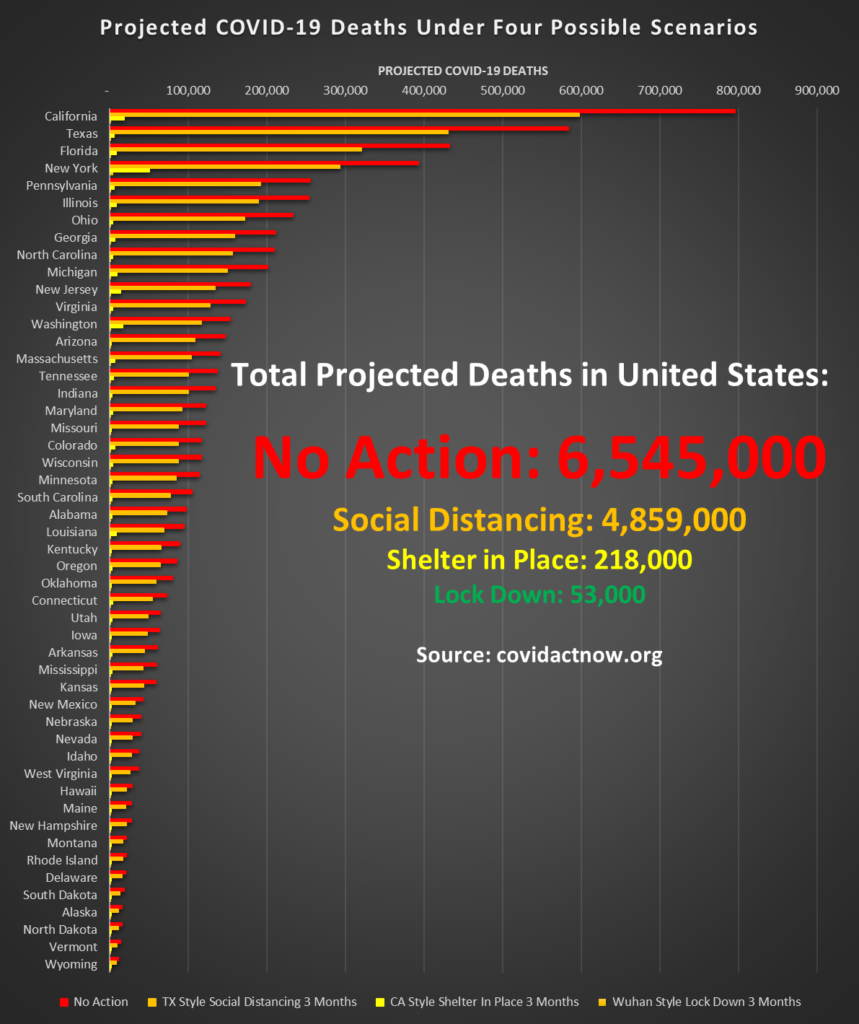
On March 22, 2020, the covidactnow.org website was brought to my attention. It showed, state by state, the likely timelines for hospitals becoming overwhelmed and the number of deaths that would ensue given four possible courses of action. March 22 seems like eons ago now, but at the time, there was much less awareness of the seriousness of this pandemic, and there were many states that were not moving to issue even social distancing guidelines, let alone stay-at-home orders. I tallied up each state’s projections in order to determine what the total projected impact of each scenario would be:
1. If we do nothing, then it is projected that more than 6 million people will die within the next four to eight weeks.
2. If we do a little bit, then maybe *only* 4 million people will die.
3. If we do “everything perfectly” (à la Dr. Birx), then *only* 200,000 people will likely die. In the next 4-8 weeks.
4. And if we do a Wuhan-style total lockdown, we could get through this with only 53,000 deaths.
What are the chances you think the United States government and populace are going to do “everything perfectly?”
Here’s another way of looking at it:
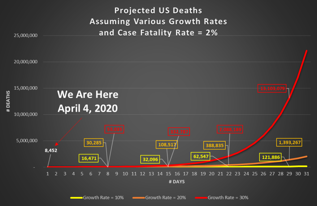
As of April 4, 2020, the total number of people in the United States who have died of COVID-19 since February 29, 2020 (35 days ago) is 8,452.
On every single day of those five weeks, people have been dying, until today the daily number of people who died reached 1,050. This number is sometimes higher and sometimes lower than that of the previous day. Yesterday, 1,519 people had died as of the time of writing. So what matters is the trend:
If the growth rate is 10 percent per day, we will have the yellow line, and 122,000 dead in 30 days.
If the growth rate is 20 percent per day, we will have the orange line, and 1.4 million dead in 30 days.
And if the growth rate is 30 percent per day, we will have the red line, and 13 million dead in 30 days.
Naturally, you have to wonder, “So what has the growth rate been? And will it continue to be that?” Funny you should ask. I happen to have been calculating the growth rate.
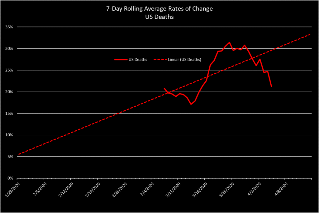
What this chart shows is that the growth rate in the number of people dying in the United States from COVID-19 since the first days of March was around 20 percent, dipped a little for a week or so, then shot up daily until it reached over 30 percent per day, held there for about five days, and has been declining for a week, but it is still above 20 percent GROWTH in the number of deaths per day.
Here’s what that looks like in terms of the actual numbers of deaths:
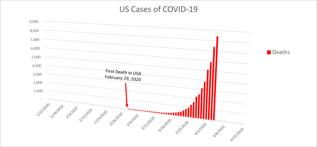
So, your next question should be, “well, how long is that going to continue before it levels off and starts to go back down again?”
Good question. How can we know the answer to that? We can’t. But we can look to the past for some instruction. So we look at the corresponding metrics for the world as a whole. And that means we’re including China, which doesn’t report things honestly and which shuts people in their homes at the end of a bayonet, and Korea, which handles things quickly and seriously and keeps this shit under control, as well as Iran, which fucks up completely, and Italy, which doesn’t take it seriously until it’s too late, and Spain and France and Germany and Belgium and England and EVERY OTHER COUNTRY IN THE WORLD with all of their strengths and shortcomings, and here is what we see:
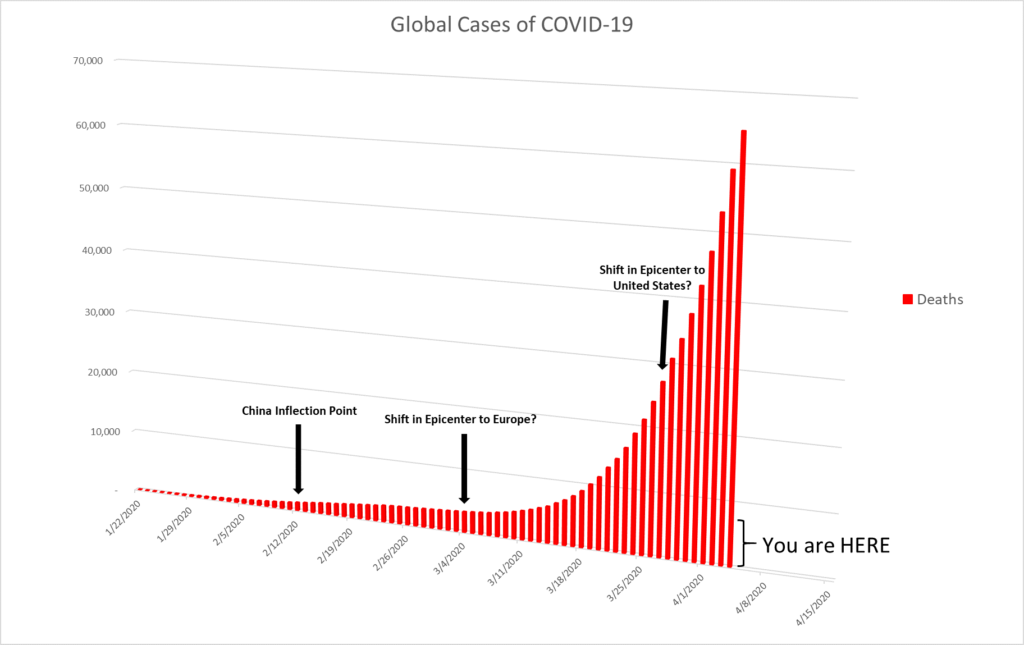
Please notice the scale on the US chart, and the scale on the Global chart. The US has not even reached the first line marker on the Global chart, indicating 10,000 dead humans. Also take into consideration that the global number INCLUDES the US numbers.
The point is that we are only just at the VERY BEGINNING of what is going to sweep across the entire United States.
You will very likely ask, “How do you know that?” And that is the right question to ask. The exact right question.
And the answer, as a friend of mine who happens to be a pulmonologist on the front lines in Chicago once told me his med school professor answered to a particularly annoying classmate who would always ask the question, “But how do you *KNOW* that’s a [insert medical phenomenon here]?” is, “Johnson, I know it because I’ve seen it before.”
The thing that we have seen before is the progression of the disease from initial infection to either recovery or to death. In the first days of an epidemic, everyone who is sick is still sick. No one has recovered yet and no one has died yet, either. These cases are classified as “Unresolved.” Recoveries and Deaths are Recoveries and Deaths. Well, at first, everyone is Unresolved. And then a few people recover and a few people die. Then gradually, you start to see that, say, 95 percent of people recover and 5 percent die. But while this is happening, new patients are getting infected and adding to the number of Unresolveds. So, while the virus sweeps across the globe, these percentages ebb and flow, as China is the first population, then Iran, then Italy and Europe, and now the United States. Here’s what that looks like:
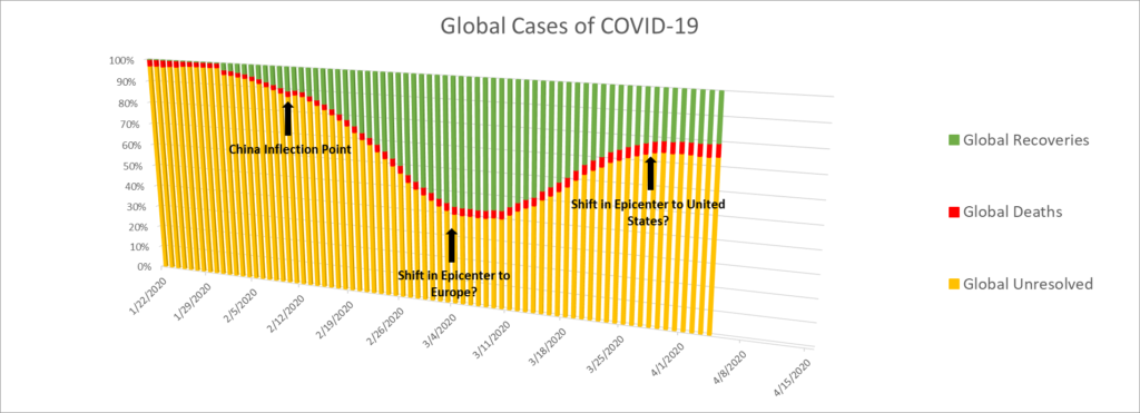
You can see that in late January, some 95 percent of all of the cases were Unresolved. As time progressed, there were more Recoveries, but the number of Deaths remained pretty constant at around 3-4 percent. By early March, there were more Recoveries than Unresolved. But then that started to change, as the pandemic hit in Europe. The proportion of Unresolved cases grew and grew and has flattened off in the last few days. Well, coincidence: the epicenter is now in the United States. As it moves through New York, we will see the number of Recoveries increase in proportion to the number of Unresolved. Until it hits in California, that is. And in Louisiana. And in Michigan. And in Illinois. And in Florida. And throughout the rural parts of the country, particularly in the bible belt.
So, that’s what it looks like globally. “Well,” you ask, “What does it look like in the United States?”
Funny you should ask.
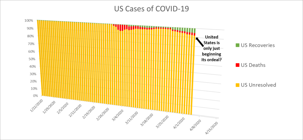
The proportion of Unresolved cases in the United States is 92.5 percent! Deaths are 2.7 percent and Recoveries are only 4.8 percent! This pandemic will be over for us when there are no more Unresolveds, and Recoveries are 95 percent, and Deaths, sad to say, will be around 5 percent.
Show this to your network of friends. Explain this to them. Beg them to please STAY HOME and to please BE WELL.
