December 5, 2020
#Stayhomebewell
Well, it’s time for my grim victory lap, my “I told you so” moment.
I first posted on March 15, four days after I pulled my kids out of school, and two days after the government declared a national emergency. Here’s what I wrote then (https://stayhomebewell.org/2020-03-15/):
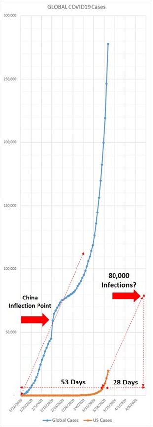
“The US is at 3,400 cases as of 4 pm today. This is where the world was on January 27. If we follow the same trajectory as the global cases did, then we will be at 20,000 cases in one week, 40,000 in two weeks, and 80,000 in four weeks.”
In the event, we were at 34,000 cases in one week, 145,000 cases in two weeks, and 570,000 cases in four weeks.
How wrong I was.
“The current number of Deaths in the US is 63. Taking that starting point from the Global data and forecasting the same growth suggests that in one week we will be at roughly 300, in two weeks at 800, in three weeks at 1,600, and at four weeks at 2,400; six weeks to 3,600, and seven weeks to 5,800.”
After one week, we had 512; after two weeks, 3,280; after four weeks, 26,184; after six weeks, 56,394; and after seven weeks, 69,885.
I have to apologize for the errors in my predictions. I clearly missed by a mile.
“It goes without saying that I don’t know the first thing about any of this. I’m just plugging the numbers into excel and calculating some ratios, plotting some graphs, and measuring some time. Of course there are innumerable variables that can influence the outcome, some of which undoubtedly work in our favor, others of which undoubtedly work against us.
“The long and the short of it is: STAY HOME.”
I published the following chart, which was bounded by a timeline of only 10 weeks. That was cute.
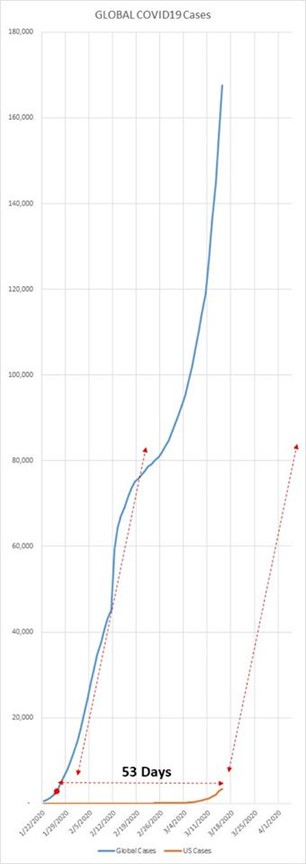
The orange line represents the number of COVID-19 cases in the United States. We were at 3,400 cases. Day after day, I added single dots to the chart, to see how the reality matched up to the prediction. The scale of the vertical axis topped out at 180,000. Ha ha… ha.
From my post of March 17, 2020 (https://stayhomebewell.org/march-17-2020/):
“Of course there are so many factors that could influence these projections, and I’m not presuming to be accounting for any of them. Government responses or lacks thereof, social norms, communalism vs. individualism, physical social mobility, and probably dozens of other factors will shape how long we have to endure this crisis. A breakthrough vaccine could put the entire thing to bed. Utterly inadequate testing suggests that the information that we think we have is likely wrong by orders of magnitude: 10x? 100x? 1,000,000x? Who knows.
“ONE THING IS FOR GODDAMN SURE: STAY HOME AND BE WELL! STOP GOING TO FUCKING YOGA CLASS YOU IDIOT.”
“Again I have to emphasize that I don’t know SHIT about any of this. In some measures I’m looking at China specifically, and in others I’m looking at the Global total, because for the first month or so, it was all China, and also because I’m just not trying to be completely anal about all of this. I’m trying to put a rough guestimate out there and see what the ball park is, because the news isn’t really answering the questions I would like to have answered.”
I attempted to project a range of possible timelines for how this pandemic was going to play out in the USA. I didn’t know how to do it on a computer, so I drew it by hand:
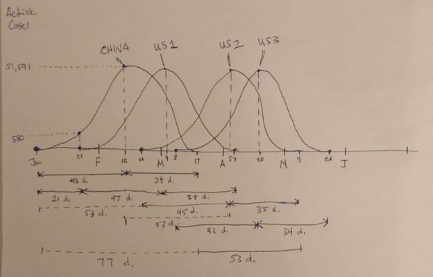
I concluded with the following:
“Much of the variable of how long we will have to endure this will depend on when people come to grips with the fact that this shit is happening. Please stay home. Please be well. #STAYHOMEBEWELL.”
Yay for me. I was right.
On the following day (https://stayhomebewell.org/2020-03-18/), using the scant information that was available at the time, I projected the exponential increase in infections, assuming a doubling time of six days, which showed we would be at 15 million infections by roughly May 20 (indicated by the red circle I’ve added today for illustration).
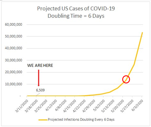
I was off by seven months. (The adherence to stay-at-home advisories and the shutting down of many business types in many states likely had a lot to do with the slowing of the spread, but here we are, nonetheless.) I hope to God that what is to the right of that circle is not impending, but I am afraid that it is.
On that same day, I published a more philosophical essay I titled “Pascal’s Wager Meets the Prisoners’ Dilemma” (https://stayhomebewell.org/2020-03-18-pascals-wager-meets-the-prisoners-dilemma/).
Sigh. Right again.
The next day (https://stayhomebewell.org/2020-03-19/), I wrote a bit about exponential growth:
“The fact of a growing growth rate means that we are still on this side of the mountain. When the growth rate starts to slow, we will have some inkling that the summit is somewhere in the distance. It is worth noting again that, in the beginning of a series of events, an increase from 1 to 2 represents a growth rate of 100 percent. To achieve another day of 100 percent growth, we would need to see the next day’s figure at 4; then at 8; then at 16, et cetera. This is the definition of exponential growth.
“At exponential growth, over a period of 30 days, 1 increases to more than 1,000,000,000. One billion.
“Now, at a rate of, say, 10 percent per day, 1 would increase to 16. And at a rate of 50 percent per day, after 30 days, 1 would increase to 127,834.”
So, it all hinges on the growth rate.
Five days into this blog, I had added five dots to my original graph, to see whether reality was tracking with my projection:
On March 21 (https://stayhomebewell.org/2020-03-21-325-pm/), I took the state-by-state projections of possible death totals under four scenarios that was projected by www.covidactnow.org, and consolidated them into a single graphic:
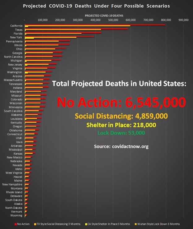
We surpassed the “Shelter in Place” scenario total on October 9, 2020.
How’s the social distancing going?
I could keep going, showing the evolution of my analysis, and where I’ve been wrong, and where I’ve been right. If anyone is interested, it’s all there in the archives of this blog. You could skip reading the text of each post, and just skim through the charts, to see how they’ve turned out in reality. Suffice it to say, many of my predictions have been pretty on the nose, all the way down to calling the exact date we would hit one milestone or another. Many have been wrong.
I’ve had to re-scale all of my graphs multiple times. As I wrote above, the first graphs were on a time scale of weeks and were bounded in by a couple hundred thousand infections. They seem quaint now. Today, I’ve extended the time frame to reach the end of 2021. Here is what those charts look like today.
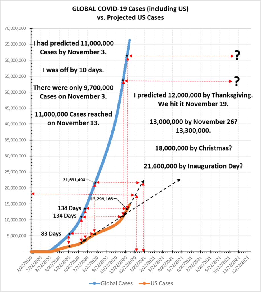
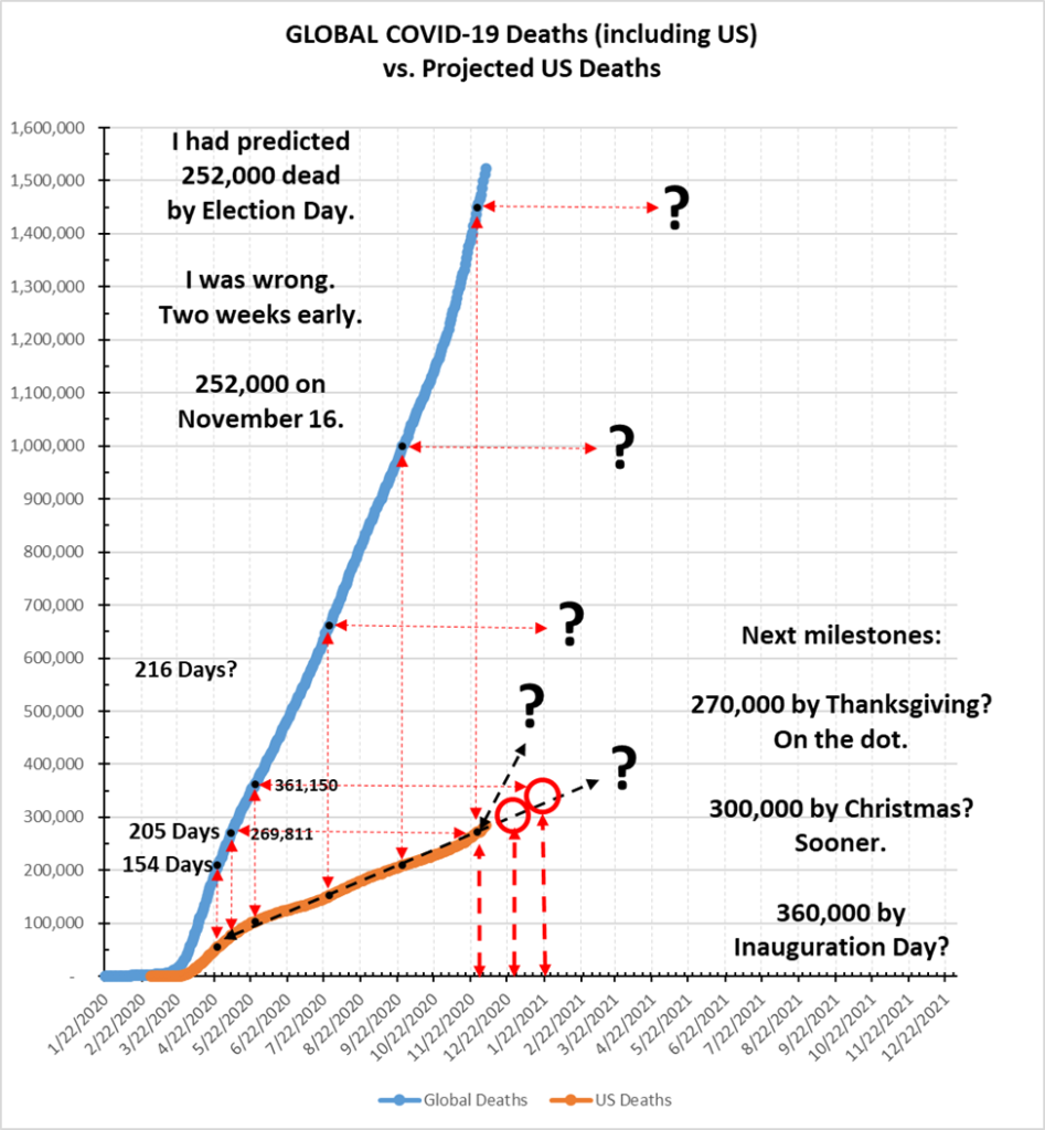
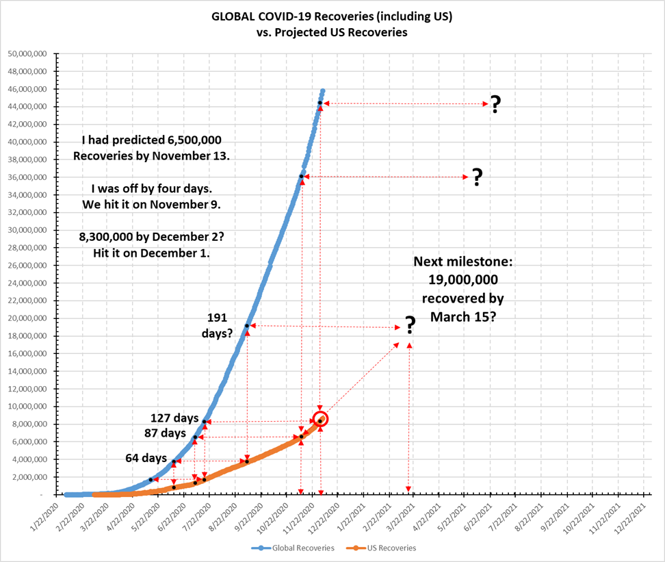
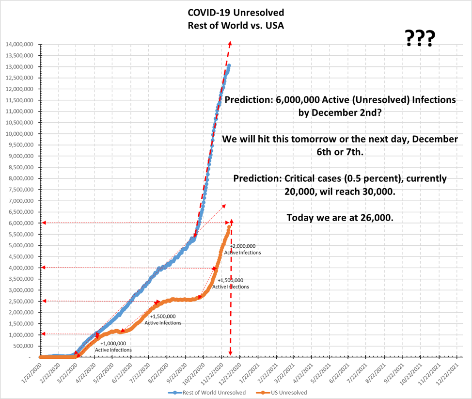
The next one is the most important, because it deals with the potential for our hospital system to be overwhelmed. Look at my posts from October 3 (https://stayhomebewell.org/2020-10-03/) and November 8 (https://stayhomebewell.org/2020-11-08/) to see what I had predicted.
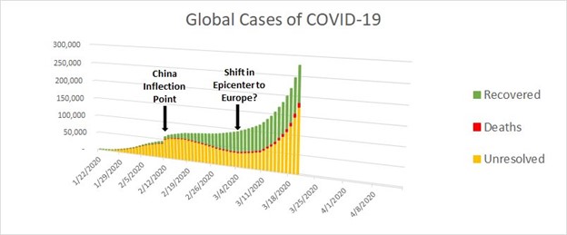
On March 20, I posted this graph:
And on March 26, I posted the graph for the United States:
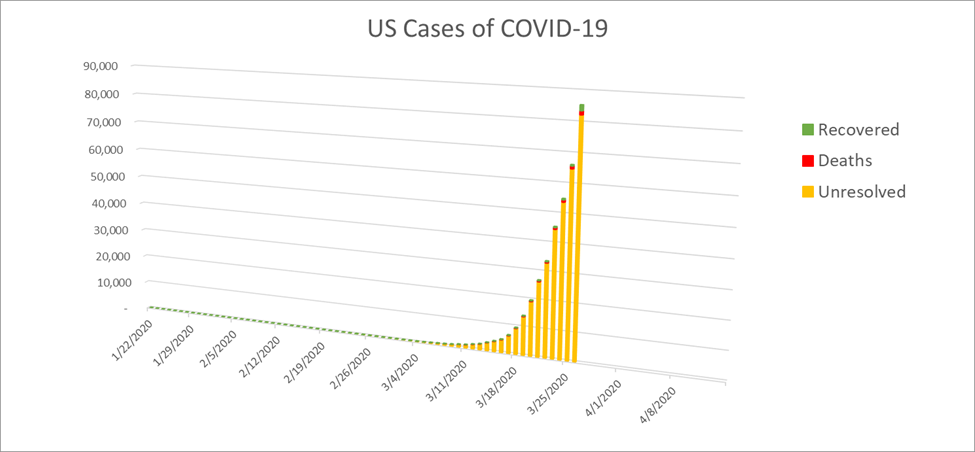
Note the scales on the axes: 90,000 cases, and time horizon April 8.
Here’s what the United States looks like today:
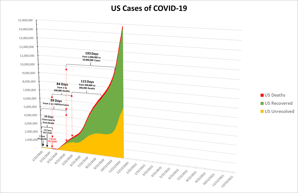
I’ve pushed the time horizon out a bit.
If the ratio of April 8 to today is any prediction of what the ratio of today to eight months from now will be, then God help us all.
Update:
I forgot to post about another prediction that I made.
On August 15 (https://stayhomebewell.org/2020-08-15/), I posted the following chart, comparing the daily Cases and daily Deaths in the United States:
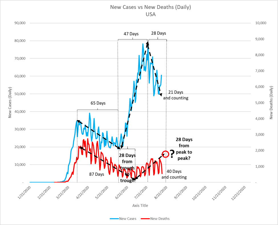
Here’s what that looks like today:
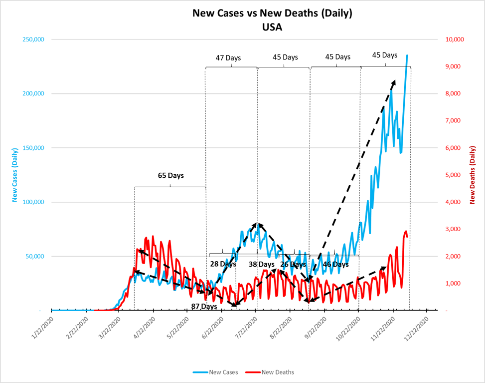
I will have to change the scale and time horizon for this graph, too.
This metric led to another, which I posted on October 24 (https://stayhomebewell.org/2020-10-24/), comparing the number of daily Cases against the number of daily Deaths occurring 40 days later:
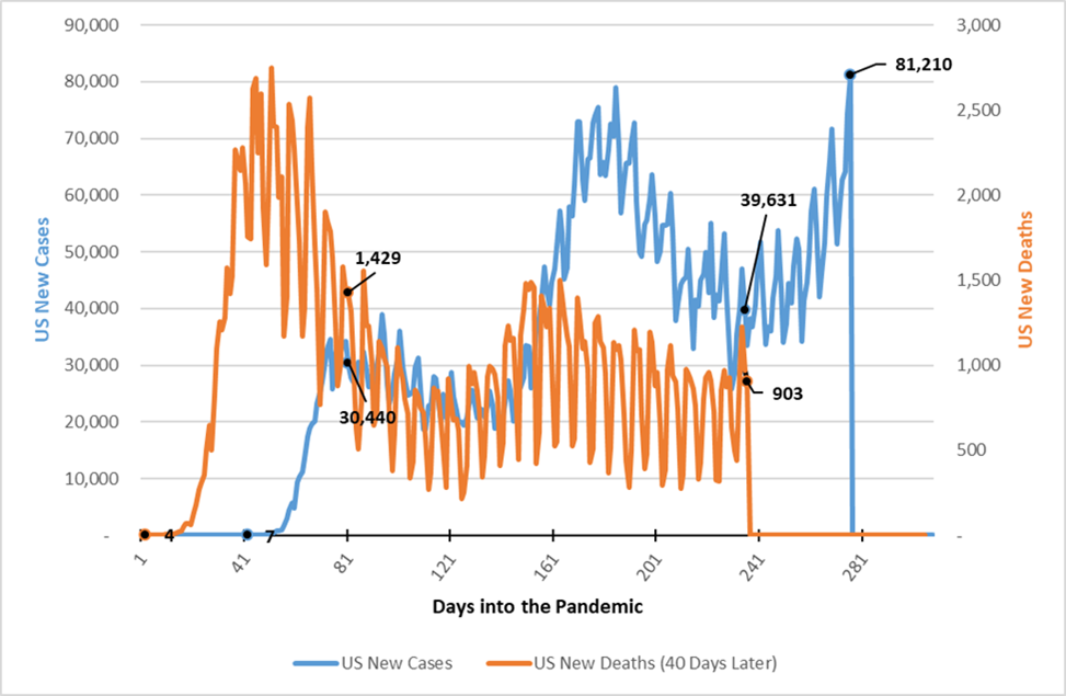
This shows that, where there had been 39,631 new cases on Day 236 (September 13, 2020), there were 903 deaths 40 days later (October 23, 2020). That equates to a Case Fatality Rate (CFR) of 2.3 percent.
The number of new Cases on that day, however, was 81,210, and we wouldn’t know how many of those cases would result in death until 40 days later, which was on December 2. At the time, I had posited that if the CFR were two percent, then the number of deaths we would see would be 1,624.
In the event, the number was 2,877:
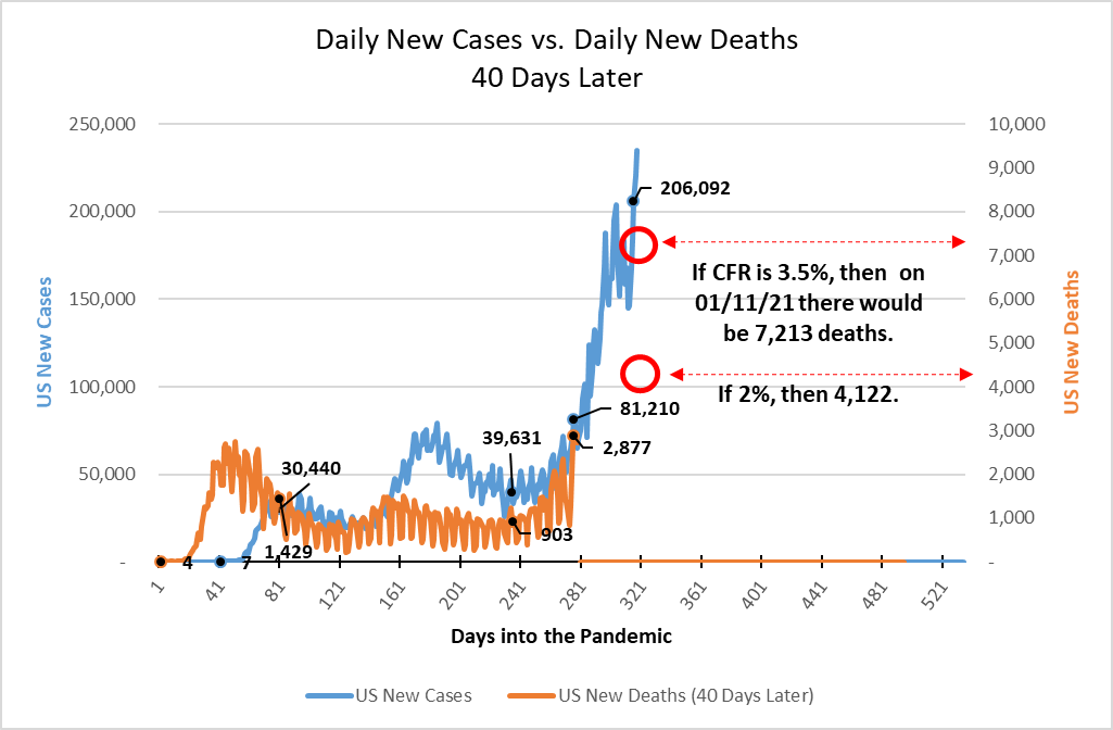
Remembering that this is based on a time lag of 40 days, that yields a nominal CFR of 3.5 percent, which is 50 percent higher than the CFR of forty days ago.
The number of new Cases yesterday was 206,092. This suggests that, forty days from now (on January 11, 2021), at a CFR of 3.5 percent, we will see 7,213 deaths.
