August 15, 2020
#stayhomebewell
We’ve reached another milestone in my projections, and I have a new metric to introduce. As always, I continue to hope that my projections will be wrong.
These posts are my feeble attempt to add a single grain to the scales on the side of good. I don’t know how Facebook’s algorithms determine what shows up in whose feeds, but it seems that the more people react, comment, or share, the more value Facebook assigns to a post. For that reason, if you read this, please don’t just scroll on to the next item on your feed without reacting in some way. Thank you.
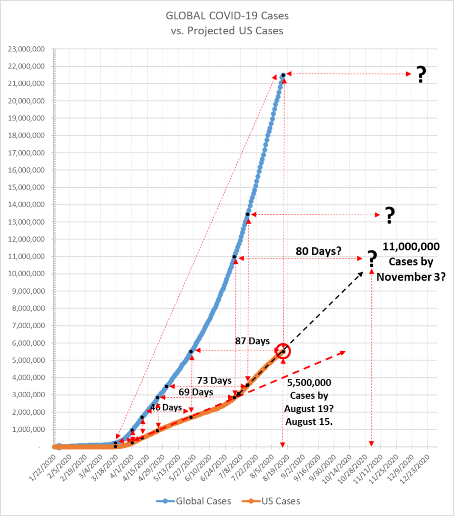
On May 22, 2020, I projected that we would reach the next milestone of 3,500,000 Cases by July 29 (see https://stayhomebewell.org/2020-05-22/), but we actually reached it on July 14 (see https://stayhomebewell.org/july-15-2020/).
On July 26, I identified a major upward shift in the Case curve that had taken place on July 2, and which changed the trajectory (see https://stayhomebewell.org/2020-07-26/). My next projected milestone number in that post was 5,500,000 cases, which I projected for August 19. As of this morning, the US has reached 5,478,009. This means that we will reach the milestone today, four days ahead of my projection. That’s two million additional cases in only 32 days, or an average of 62,500 new cases per day.
Projecting along the same trajectory identified on July 2, the next milestone will be 11,000,000 total Cases by November 3, 2020, eighty days from now.
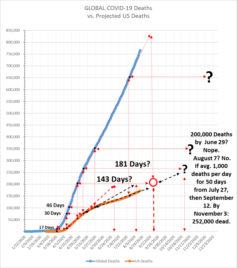
The US Deaths curve slowed down from May 6. According to my triangulation method, on that date it appeared the US would reach 200,000 deaths by July 29. By May 26, when we reached 100,000 deaths, the vector suggested August 7; using the next milestone point of 150,000 on July 27, the trajectory suggests September 15. As of yesterday, August 14, we were at 171,535. If we average 1,000 deaths per day for the next 29 days, then we reach 200,000 dead by September 12. And if we continue at that rate of 1,000 deaths per day, then by November 3, or fifty-two days later, the United States will have reached a quarter-of-a-million dead.
Today I have some new analysis, suggested by a friend, of the correlation between Cases and Deaths. One of the questions that many have been asking is why we are not seeing the movement in the numbers of Deaths correspond with the movements in the numbers of Cases. I don’t know the answer to this question, but the data do shed some light.
I’ve discussed the length of the illness periodically throughout my posts, in relation to various graphs, and focusing on the fact that it takes a certain amount of time for a person newly infected with COVID-19 to either recover or die, and that this time period can be seen in some of the metrics. In my post of July 26, I noted that the term “quarantine” is derived from the Italian “quaranta giorni,” or “forty days,” referring to the length of time incoming ships were required to stay docked before sailors or goods were permitted ashore in Italy during periods of bubonic plague.
My friend suggested a very simple measure: compare the New Cases to the New Deaths and see how the shape of the curves correlate. Here is what those graphs look like for the Rest of the World (excluding the United States) and for the United States:
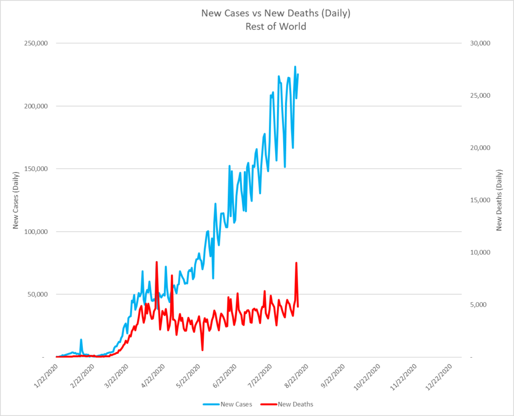
You can see that, while Cases (left vertical axis) are measured on a scale that is roughly 10 times greater than that of Deaths (right vertical axis), the shapes of the curves correlated closely until approximately April 29, at which point Cases began to rise sharply, while Deaths remained relatively flat. I suspect that this is likely a reflection of changes in testing. Whereas at the beginning of the pandemic, testing was likely limited primarily to those who were already so sick that they were admitted to hospitals, as time went on, testing likely became more widely available, and so the number of Cases relative to the number of Deaths went up sharply. Many of those newly identified cases undoubtedly went on to recover. The fact that the number of Deaths reached approximately 5,000 per day in mid-April and remained at around that same level over May, June, July, and now August, suggests that the prevalence of infection may have been much higher much earlier than was previously known.
In the United States, a similar correlation in the shape of the curves was present from early/mid-April until mid-June, when the number of Cases took a decisive and pronounced upward turn. Interestingly, while the Death curve bottomed 28 days later, its return to upward trajectory has not matched the magnitude of the Case curve. To my mind, this also suggests that an increase in testing throughout the United States yielded many more positive infection results that had likely been present in March and April, but which had gone undetected.
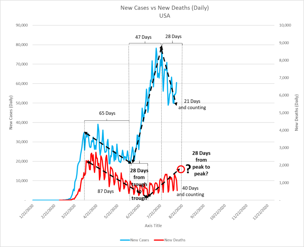
Let’s unpack this graph.
Daily New Cases skyrocketed from March 15 to April 4. Then, for the next 65 days from April 4 to June 7, they trended downward, bottoming at just under 19,000.
Daily New Deaths followed the same shape, decreasing from April 8 to July 4, or for 87 days.
The time lag from June 7, when Cases returned to an upward trend, to July 4, when Deaths returned to an upward trend, was 28 days.
Cases trended upward for the next 47 days, from June 7 to July 24, as New Cases rose from under 19,000 to over 78,000 per day. And for the last 21 days, Daily New Cases numbers have fallen.
I don’t know how long this decrease in Daily New Cases will continue, but if we take as a data point the fact that there was a 28-day time lag between the first bottom in the Case curve and the bottom in the Death curve, then perhaps we can posit that there should be a similar lag between the peaks in the Case and Death curves. And since the Case curve peaked on July 24, then we can posit that the Death curve might peak on August 20, or five days from now. And if the curve follows its current trajectory, then that peak should occur at a level of approximately 1,800 deaths on that day.
Similarly, since the upward portion of the Case curve lasted for a duration of 47 days, if the upward duration of the Deaths curve is the same, then that would place the peak in Deaths at August 22, or two days later than that predicted by the time-lag theory.
Now, let’s look more closely at time lags.
If we take the biblical 40 days (the rains of the Flood fell for 40 days; Goliath challenged the Israelites twice a day for 40 days until he was felled by David; Moses spent three consecutive periods of 40 days and 40 nights on Mt. Sinai; Jesus fasted in the desert for 40 days; the period between his Resurrection and Ascension was 40 days; Lent lasts for 40 days, etc.) as our time lag, let’s see what happens.
The Rest of World and US Case Fatality Rates (CFRs) have reached 3.73 percent and 3.13 percent, respectively, and they’ve tracked one another pretty closely since about mid-April, when both rates were 4.75 percent. Over the last four months, both rates have fallen slightly, but both the duration of their convergence and the similar levels suggest strongly that three percent is a reliable CFR.
Taking this as a starting point, let us calculate the CFR for any given date by dividing the number of New Cases on Date NC by the number of New Deaths on Date NC+40. In other words, if the number of number of New Cases in the Rest of World was 100,325 on May 30, then we should see roughly 3,000 New Deaths forty days later, or on July 8. In the event, the number of Deaths on July 8 was 4,467, yielding a CFR of 4.63 percent.
Similarly, if the number of New Cases in the United States was 23,740 on May 30, then on July 8 we should have seen approximately 712 Deaths; the reported number was 890, yielding a CFR of 3.75 percent.
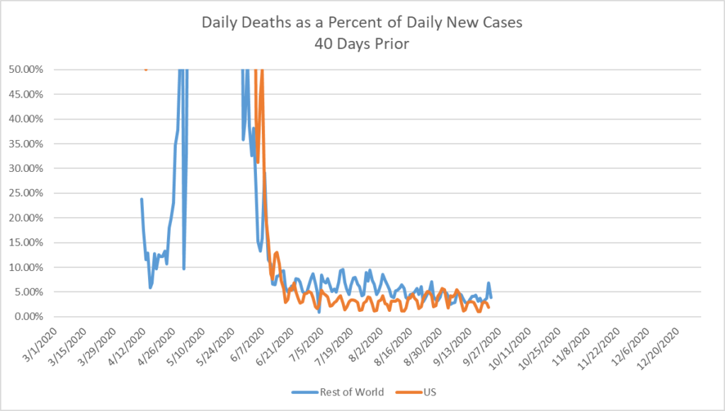
Here is what the comparison of those two trailing measures looks like:
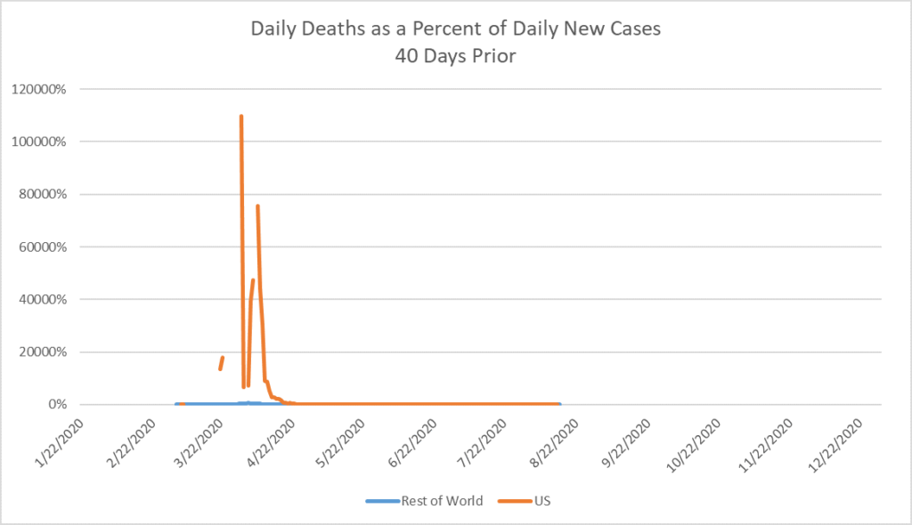
The scale is skewed by the fact that in the early days of the pandemic, there were instances of CFRs in the tens of thousands of percent, such as on March 23, when there were 181 deaths in the United States, but there had been only a single New Case recorded 40 days prior, on February 13. The same was true on March 31, when there were 1,098 Deaths, but 40 days prior, on February 21, there had been only one new Case.
If we cap the scale at 50 percent, we can see that the time-lagged CFRs track one another very closely, and have fluctuated in a range between 10 percent and one percent since mid-June. The Rest-of-World CFR has been just about two percentage points higher than that of the United States for the last 100 days.
Make of this what you will.
With regard to the future: I have operated and continue to operate under the assumption that the US government and populace will make nearly every wrong decision it is possible to make. So far, this has stood me fairly well. On the US government front, I have not seen any change in policy or approach that would suggest any improvement. To the contrary, there have been numerous signs suggesting that things will deteriorate. On the popular front (ha, I made a funny), results have been mixed. Numerous school districts have opted for fully virtual returns to school. Others have plowed full speed ahead, damning the torpedoes, only to have gaping holes blown into their hulls, as we’ve seen over the last weeks as school reopened, found rampant positive cases, and then ordered hundreds of students and teachers to go into 14-day isolation. I wonder what they think is going to happen on Monday?
It is also worth taking note of significant dates and events as they occur, in order to check for correlations 14 days later (for the onset of symptoms and discovery of new Cases). Some such significant dates have been:
May 25-26: Memorial Day, George Floyd murdered, Black Lives Matter protests begin: There were 19,899 new Cases on May 25. Fourteen days later, on June 8, there were still only 19,055. Fourteen days later still, though, on June 22, there were 31,499 new Cases. This is an increase of 65 percent.
June 20: Trump Rally in Tulsa, OK: There were 33,392 new Cases on that day. Fourteen days later, on July 4, there were 45,182 new Cases. Increase: 35 percent.
July 3, Trump Rally at Mt. Rushmore; July 4, Independence Day: As noted, there were 45,182 new Cases July 4. Fourteen days later, on July 18, there were 63,259 new Cases. Increase: 40 percent.
July 23: Tokyo, Japan Summer Olympics cancelled. Otherwise 600,000 foreign visitors expected.
July 23: San Diego, CA Comic Con cancelled. Otherwise, 130,000 expected.
July 28: Mecca, Saudia Arabia, the Hajj cancelled. More than 2,000,000 attendees expected otherwise.
August 7-16: Sturgis, SD motorcycle rally: Estimated attendance will be 250,000, or half of last year’s number. There were 63,345 new cases on August 7, and we’ll see what the daily case numbers are tomorrow evening, when the rally ends and the attendees return to their homes throughout the country. Fourteen days later will be August 30. I’ll put a reminder in my calendar to check the new Case number on that date.
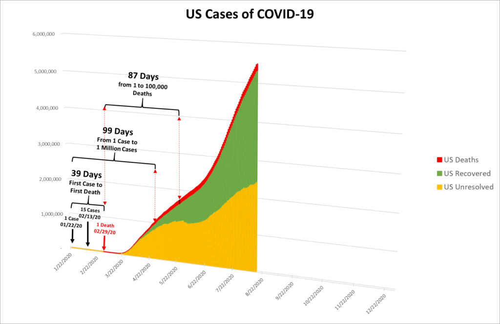
Here’s a visualization I haven’t presented in a while, for another way of looking at the pandemic in the United States:
Vote.
