June 24, 2020
#stayhomebewell
Do me a favor: if you read this, please react with a like or an angry or a sad or whatever. I’m lonely and it feels like I’m just doing this for six people.
If you are overwhelmed by all of the information that is coming out about the pandemic, I have some charts that should explain very succinctly what is going on, both on a global level, and in the United States. They are succinct if you know how to read and interpret charts and graphs. If not, I’ll offer some explanation.
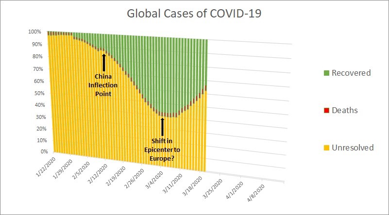
On March 20, 2020, I posted this graphic:
I wrote:
“In the beginning of the pandemic, when all activity was concentrated in China, there were many cases and no recoveries, which meant that Cases/Recoveries was infinity. At the point when there were 17,000 cases and 500 recoveries, this ratio was 3,400 percent. Cases increased, but recoveries also increased, and this ratio came steadily down. At China’s inflection point on February 12, the ratio stood at 990 percent. The inflection point was the day of the peak in the rate of growth in total cases. From February 12 until March 6, that ratio declined from 990 percent to 176 percent, meaning that the recoveries were gaining ground. After March 6, the ratio began to increase again, which I think represented the movement of the pandemic’s epicenter to Europe. From March 7 till today, that ratio has been increasing, and currently stands at 302 percent. An upward slope will mean that cases are outnumbering recoveries, and I think it will continue to be indicative of the virus’ movement geographically. When the virus has devastated Europe, the curve will turn downward again. And then it will turn upward again, representing its movement through the United States.”
Here is how that chart has developed:
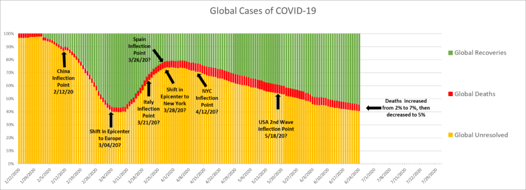
It has happened exactly as I predicted. The proportion of Recoveries peaked at 57 percent on March 7, while Unresolved was at its lowest level, with 40 percent of all cases (Deaths accounted for three percent); and then the proportion of Unresolved cases peaked at 74 percent on March 31, while Recoveries were at their lowest level, 21 percent (Deaths had increased to five percent of all cases).
The current proportion of Recoveries is 54 percent, Unresolved are at 41 percent, and Deaths still account for five percent of all cases.
What I predict now is that the proportion of Recoveries may rise a few more percentage points, or may not, but it will begin to fall again soon. Unresolved may drop another point or two, but will begin to rise again soon.
What does this mean, and why is this my prediction?
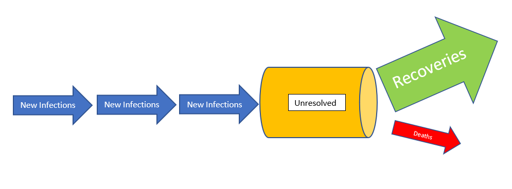
Think of the hospital system as a pipe. New infections are entering the system. Sometimes more, sometimes fewer. While they are in the hospital, there are only two possible resolutions: recovery or death. Some people recover quickly, and some are sick for a long time before they recover. Similarly, some die quickly, and some are sick for a long time before they die.
Globally, the history to date shows that roughly five percent of all recorded infections end in death. (I’m not going to even consider the fact that we don’t know the actual denominator, because we can’t see asymptomatic cases who have not been tested. I know. That’s old news. Move on. We are just talking about the data that we do have.) Today the number of deaths recorded globally is 483,959 out of 9,520,199 total cases. That’s 5.8 percent. In the United States, those numbers are 124,281 deaths out of 2,463,271 total cases. That’s 5.05 percent. Go figure.
Here is what I published on March 26:
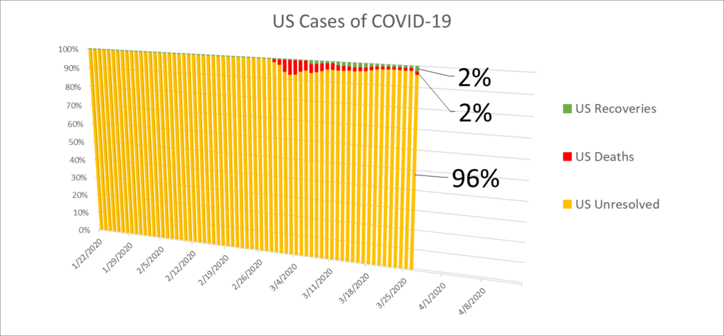
Here is what the situation looks like in the United States today:
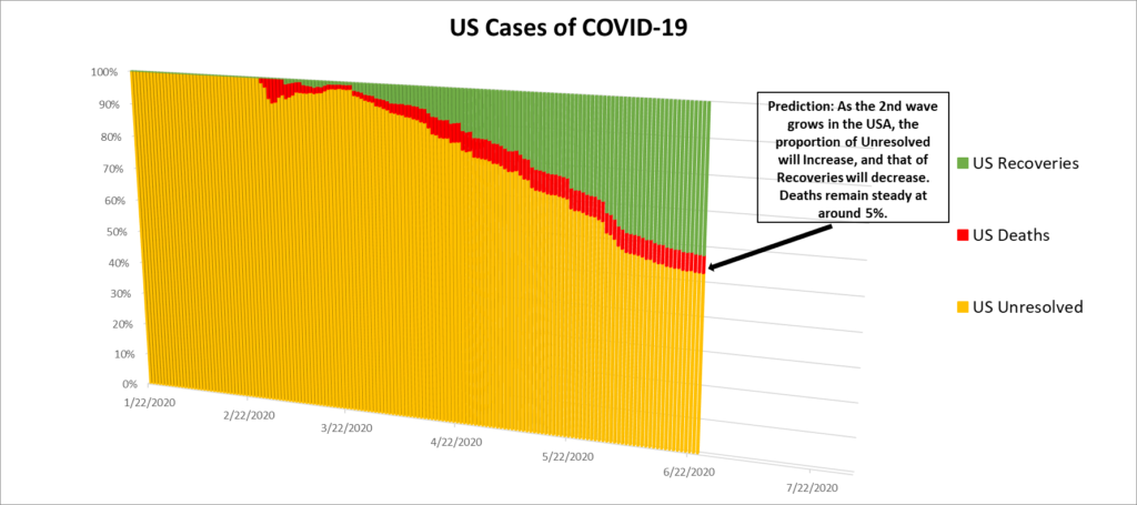
From the time I began following and analyzing this data, my analysis has been informed by one particular assumption: that the U.S. government and populace were both going to fuck up as badly as possible at every single juncture. So far, that assumption has stood me well, as my predictions have mostly all borne out, almost to the letter. I suppose, to paraphrase the words of EYE-gor in the movie Young Frankenstein, “It could be worse — it could be raining.”
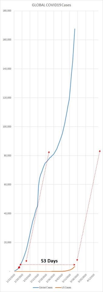
This is why the trajectories I have plotted have assumed that things would carry on pretty much as they had done, and that past performance would be a pretty reliable predictor of future performance. Well, here is the graph that I published on March 15, when there were 3,777 total cases in the United States:
Here is what that graph looks like today:
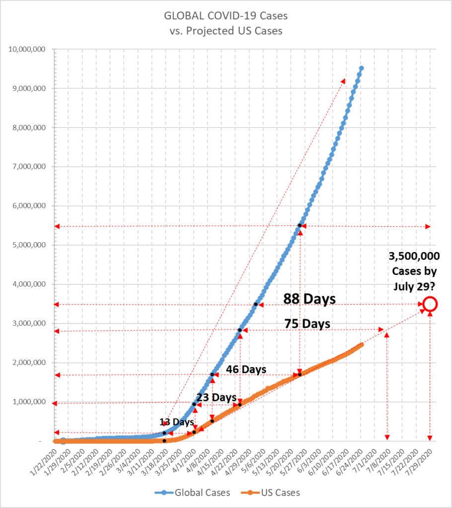
I explained in an earlier post how I came to triangulate my projections. On a given day, we’ll call it Day 1 (March 18, in this case), I marked how many cases there were in the United States, and how many there were globally. Then I plotted the daily case numbers until the United States reached the number that had been present globally on Day 1. As it happened, it took 13 days for the U.S. to reach that level. I then marked how many cases there were globally on that day, which we’ll call Day 2 (April 1, in this example). Then I plotted the daily points until the U.S. reached the same level, which happened to take 23 days. For good measure, when the U.S. reached a nice round number like 500,000 cases, I marked the global level, and that provided yet another point for my triangulation. These points describe a trajectory, and assuming that tomorrow will be mostly just like today, that trajectory has been a straight line at a particular slope. You can see for yourself that for the last 85 days, reality has tracked my projection almost exactly.
Spooky, huh?
I don’t have a powerful computer. I’ve never taken a single statistics class. I don’t know anything about viruses, medicine, or epidemiology. I don’t know what an API is. I don’t know how to automate a data feed. I don’t know how to program computer code. I don’t know html and cannot build a website.
But somehow, I have been ahead of this thing from day one. Ahead of Harvard, ahead of Johns Hopkins. Ahead of the CDC and the WHO. Ahead of the news networks, that’s for damned sure. Occasionally, I have pointed out moments when these expert sources made some statement that I had made weeks or days earlier.
My point in emphasizing this is not to say, “look what a genius I am.” My point in saying this is that
IT’S.
NOT.
THAT.
COMPLICATED.
The thing that is the most important in this pandemic, to my mind, is that, if and when you need a hospital bed, THERE HAS GOT TO BE A HOSPITAL BED AVAILABLE. If everyone gets sick at the same time, we overwhelm the hospital capacity, and then people don’t get the treatment that might mean the difference between recovering and dying. New York’s Governor Cuomo articulated this point well and consistently throughout New York’s ordeal.
The thing that has only recently gained the attention of the news, it seems, is what I have been focusing on the whole time. On March 21, I published the following graph:
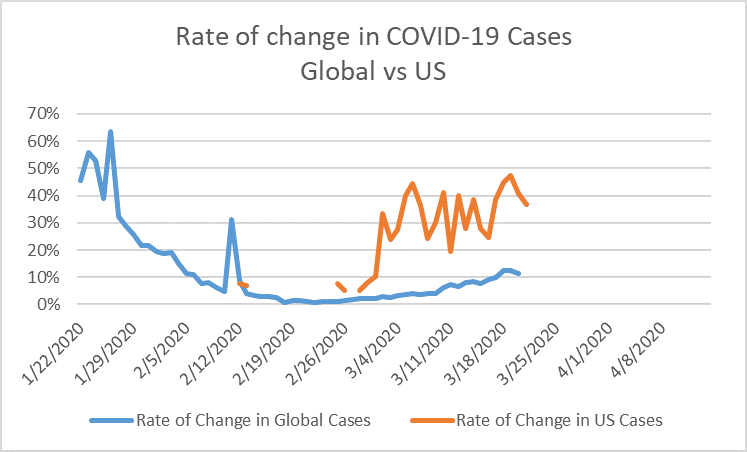
I emphasized that, while an increase from 1 to 2 is 100 percent, and from 100 to 110 is 10 percent, an increase from 1,000,000 to 1,010,000 is just one percent. At that time, no one could imagine that we would have such numbers in the United States. And yet, here we are, with just under 2,500,000 cases. We will hit that number tomorrow almost certainly.
If we return to the analogy of the hospital system as a pipe, we can see that the most important figure out of all of the numbers and ratios is the GROWTH RATE IN UNRESOLVED CASES.
This figure illustrates the relative changes in the rates of growth in Cases (new infections), Recoveries, and Deaths. That is to say, we could have a situation in which the number of new Cases is increasing, but if the number of Recoveries is also increasing, and increasing more quickly than the number of new infections, then the number of Unresolved cases (actual sick people in actual hospital beds) will DECREASE, and the growth rate in this figure will be a negative number.
Conversely, we could have a situation in which the number of new Cases is decreasing, and the number of Recoveries is also decreasing, but is decreasing less quickly than the number of new Cases, in which case the number of Unresolved cases (actual sick people in actual hospital beds) will INCREASE, and the growth rate in Unresolved cases will be a positive number.
The worst case scenario, then, would be if the number of Cases (new infections) is INCREASING while the number of Recoveries is DECREASING, meaning that the strain on the hospital system is increasing, because the capacity of the hospital system is finite.
(I acknowledge that most of the positive cases will not require hospitalization; globally, two percent of Unresolved cases are hospitalized as “serious” or “critical,” and the corresponding figure for the United States is 1.27 percent.)
The single metric that illustrates all of this, is the growth rate in Unresolved cases.
Here is the graph for Unresolved cases globally:
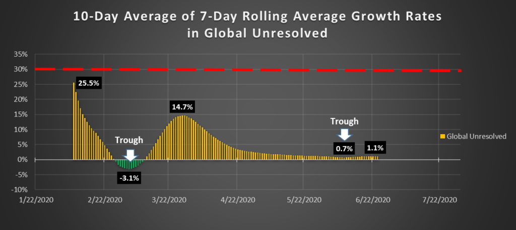
You can see that the number of Unresolved cases was decreasing in late February and early March, as China was locked down and the number of daily new infections was decreasing quickly. At the same time, the number of new infections was increasing in Iran and Europe, but not as quickly as the China cases were decreasing. On March 11, the rate of growth in Unresolved cases globally returned to positive territory, more or less marking the start of the nightmare in Italy.
(I should note that each bar on this chart is not the daily growth rate; nor is it the 7-day average of daily growth rates. The fluctuations in reporting are too great to draw solid inferences from daily figures or even 7-day figures. Each bar in the chart represents the average of TEN seven-day averages, making the curve smooth, and removing the possibility of inferring a false trend. I call this an “extended” rolling average growth rate. A trend in this chart is a trend you can take to the bank.)
So, as you can see, the growth rate in global Unresolved cases peaked at 14.7 percent on March 28. That was over an absolute number of 490,678 Unresolved cases worldwide. Since that time, the number of cases has only grown, but the rate of that growth has decreased each day, which is what I have been predicting would happen, until it finally bottomed out at growth of only 0.7 percent on June 9th. This was over an absolute number of 3,299,843 Unresolved cases worldwide.
What this means is that, while the number of new Cases in New York, New Jersey, and Massachusetts had peaked and begun to decline rapidly, the increases in countries like Brazil, Russia, and India had not yet picked up enough momentum to turn the growth rate in global Unresolved cases back to daily increases. As I said, that bottom occurred on June 9th, and the rate has been slowly increasing since then. Today’s rate of growth was 1.1 percent, over a base of 3,866,473 Unresolved cases worldwide, which means that the strain on the global health care system was increased by more than 35,000 cases TODAY.
Here is what the situation in the United States looks like:
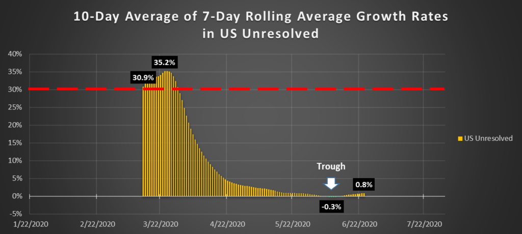
The growth rate in the United States actually went into negative territory for a period of eight days, from June 6th to June 13th, forming a bottom at growth of -0.3 percent for four days (June 8th-June 11th). The rate returned to positive territory on June 14th, and reached 0.8 percent growth today. Over a base of nearly 1,300,000 currently sick people in the United States, that 0.8 percent growth represents an increased strain on the U.S. health care system of 18,071 sick people. The 16,541 currently serious or critical cases in the United States comprise 1.27 percent of the total Unresolved cases.
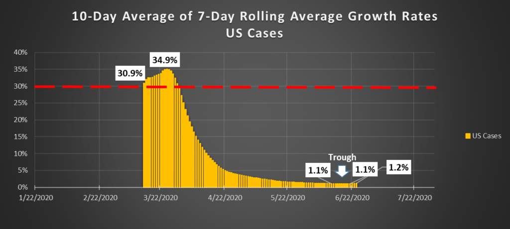
Now, as if this all weren’t enough, here is where it gets truly frightening: The extended rolling average growth rates in new Cases in the United States bottomed at 1.1 percent for the 10 days from June 12 to June 21. This means that for each of those 10 days, the number of new cases was between roughly 20,000 and 30,000 (average was 26,000 new cases per day). For the last three days, the rate has been 1.2 percent, representing daily increases of thirty-one, thirty-six, and thirty-nine THOUSAND new cases per day. As every news channel is now reporting, those are concentrated in Texas, Florida, and California.
But, yeah, I sure do want to go to Coachella. I just love Green Day.
