October 24, 2020
#stayhomebewell
***A bit of housekeeping: I discovered that, if viewed on a computer, when you try to zoom in to see the charts in greater detail, the charts themselves don’t resize—only the surrounding text does. However, when viewed on a phone, using the two-finger pinch and expand, you can zoom in to see all of the details perfectly clearly. If you’ve been reading via a laptop, try bringing the posts up on your phone, and you’ll be able to see everything much better.
It has been three weeks since my last update on October 3 (https://stayhomebewell.org/2020-10-03/). In that post, I alerted you to the fact that the wave in the relative proportions of Recovered and Unresolved cases in the rest of the world (excluding the United States) had inflected, at 78 percent Recoveries and 19 percent Unresolved (with Deaths holding steady at 3 percent).
Well, it turns out that, while I’m pulling the numbers each day from www.worldometer.info, whoever is maintaining that data set is going back and changing the numbers, presumably as changes to the data come in from reporting agencies in countries throughout the world. Thus, whereas on October 3rd I reported that the inflection point had come on September 30, it turns out that the peak at 78 percent has actually persisted through October 16. I’m confident now, because for six days after, the proportion was 77 percent, and today it has decreased one more percentage point, to 76 percent.
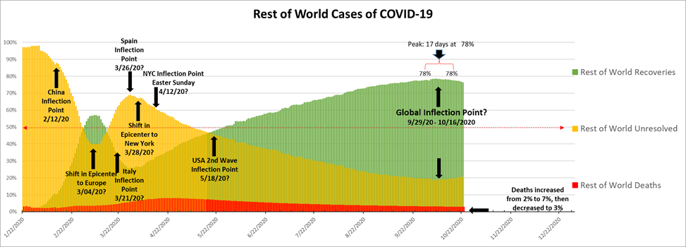
I further explained on October 3 that I thought that we would see a precipitous rise in the number of active, Unresolved cases over the next two months or so. Well, in the last three weeks, I’m certain you’ve seen the news. The stories about how hospitals were starting to reach capacity and expand into overflow wards began showing up about a week later. Michael Osterholm, from the University of Minnesota, said on October 18 that, “The next six to twelve weeks are going to be the darkest of the entire pandemic” (https://news.yahoo.com/full-osterholm-next-six-twelve-134925636.html).
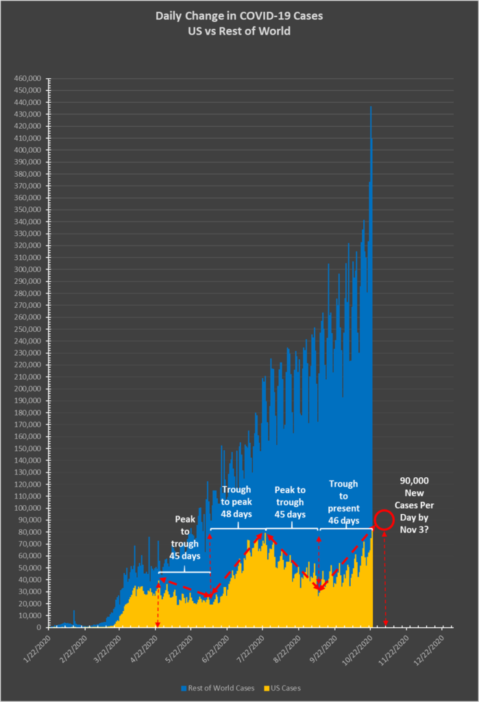
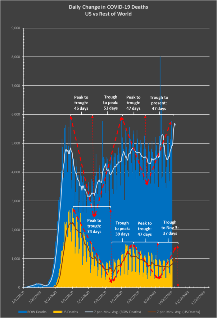
My prediction of two months lands smack dab in the middle of Dr. Osterholm’s time frame. Here is what the US looks like right now:

Honestly, I’m not sure how this is going to work. I might have this all wrong. The inflection in the United States might not come at 75 percent Recoveries, as it has in the Rest of the World. Because of the rapid recent increase in New Cases, perhaps the United States will inflect at some lower level, like the 65 percent, at which it has stood for the past 11 days. There are a few other ways to look at these metrics, to try to get a perspective on it. Again, as I’ve insisted since my very first post on March 15, I don’t know anything about any of this. I just take three numbers and input them into a spreadsheet every day, and these are the graphs that result.
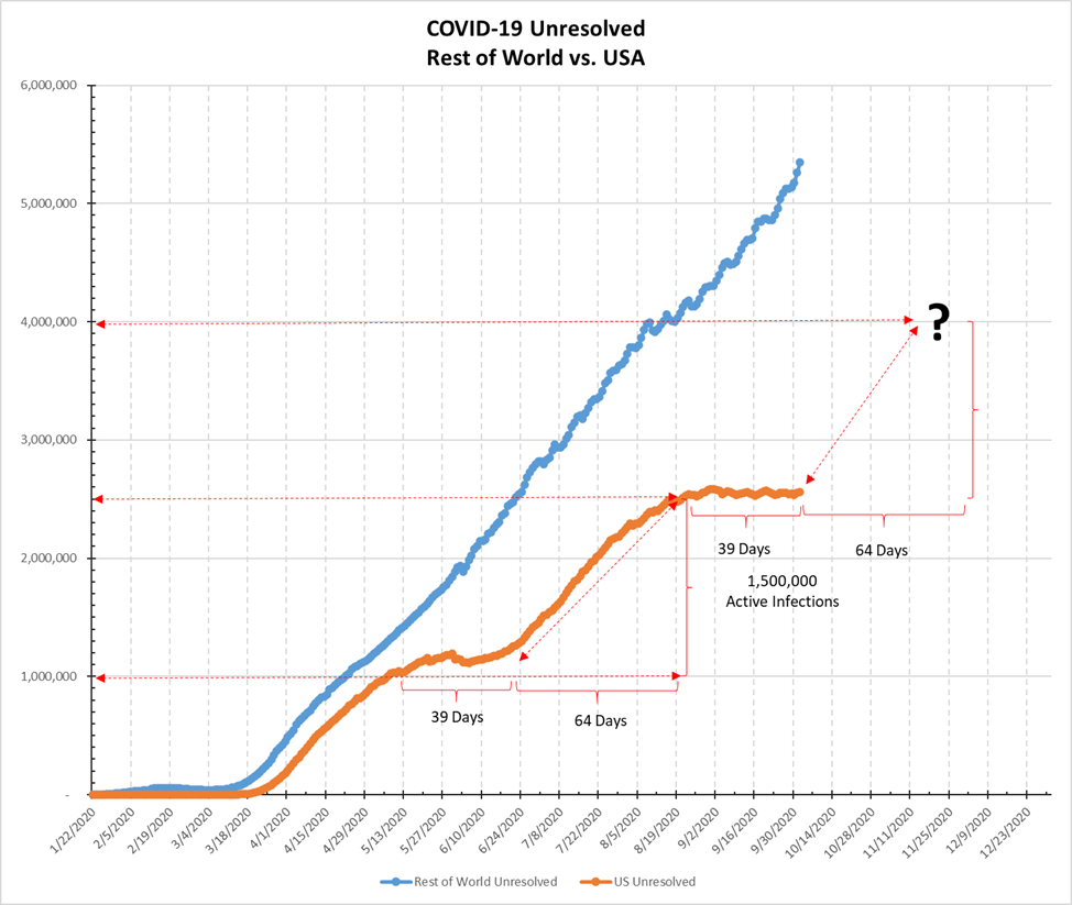
Here’s what the graph of the Unresolved Cases in the United States looked like on October 3rd:
And here’s how it has progressed over the last 21 days:
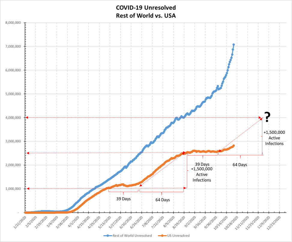
The reality is conforming pretty closely to the prediction.
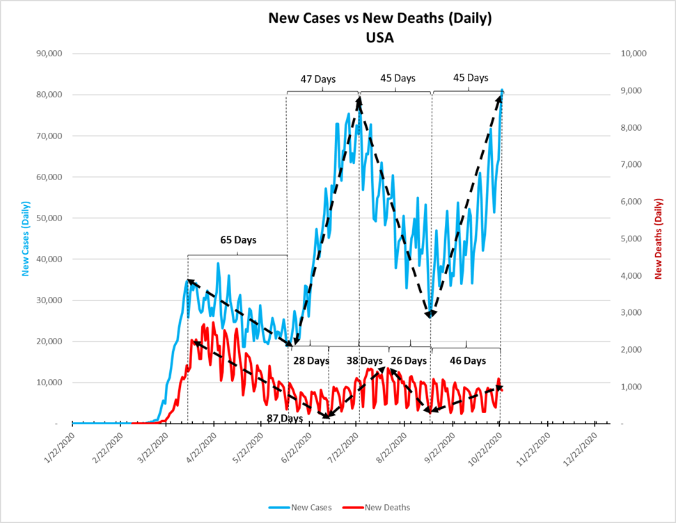
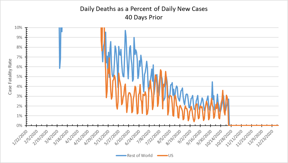
Here’s an update on a different metric I presented for the first time on August 15th (https://stayhomebewell.org/2020-08-15/). This posits that there is a time lag of roughly 40 days in the New Cases curves that then is reflected in the New Deaths curve. This analysis accomplishes two things: first, it supports the hypothesis that the effect of the novel coronavirus on victims in the United States is roughly the same as its effect on victims throughout the world. While the health care system in the United States may be better than that in some countries and worse than that in others, if we chart the daily deaths as a percent of the daily new cases that occurred 40 days prior, we arrive at an estimate of the global Case Fatality Rate (CFR) and of the US CFR:
A different view has us look at the absolute values of daily New Cases in the United States, compared to the daily New Deaths 40 days later. This one is complicated, and I’m not sure I’m presenting it properly. But here’s an attempt to explain it.
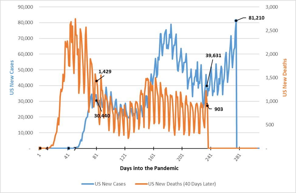
The blue line represents daily new Cases, and is measured by the left axis in the tens of thousands. The orange line represents daily new Deaths, and is measured by the right axis, in the thousands. In the beginning of the pandemic, the United States had virtually no testing capacity, so even though we were unaware of the number of new Cases, we knew when someone died in an intensive care unit on a ventilator. For that reason, if we look at Day 40 of the pandemic, the number of new Cases barely registers on the graph with a value of 7, while the number of new Deaths at Day 1 similarly barely registers, with a value of 4.
At Day 81, however, the number of new Cases was 30,440; the number of new Deaths on that day was roughly 1,429, or 4.7 percent. The blue line for new Cases leads in the chart, and the orange line for new Deaths lags by 40 days. In this way, we can see whether the shapes of the two curves correlate. I’m not exactly sure how to interpret this chart. You can see that the latest entry for New Deaths, day 236, has a value of 903. This was yesterday, October 23. The corresponding number of new Cases, from 40 days ago (September 13) was 39,601. That yields a CFR of 2.3 percent. We won’t know how many of today’s 81,210 new cases will have died until 40 days from now, on December 2. If the CFR is two percent, then we would expect to see roughly 1,624 dead on that day. I’ll mark my calendar to check this prediction.
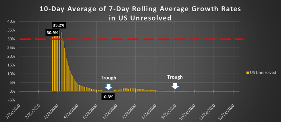
Having said all of that, now I want to return to the center ring of the big tent, as it were. If you’ve followed my blog from the early days, you will recall that the above chart contains the metric I focused on for several months: the daily growth rate, averaged over ten 7-day rolling averages, of the number of Unresolved Cases in the United States. In other words, but what percent was the number of people who might need to be hospitalized growing each day.
To review, in the beginning of the pandemic, when the absolute numbers were very small, an increase from 100 sick people to 130 sick people represented a daily growth rate of 30 percent. Some time later, an increase from 1,000 to 1,100 sick people represented a greater absolute change (100 people > 30 people), but a smaller rate of growth (30 percent > 10 percent). As the absolute number grew and grew, even the smallest growth rate, so long as it was positive, was a very troubling indicator. That is, an increase from 1,000,000 to 1,010,000 represents an absolute increase of 10,000 sick people in a single day, but a growth rate of only 1 percent.
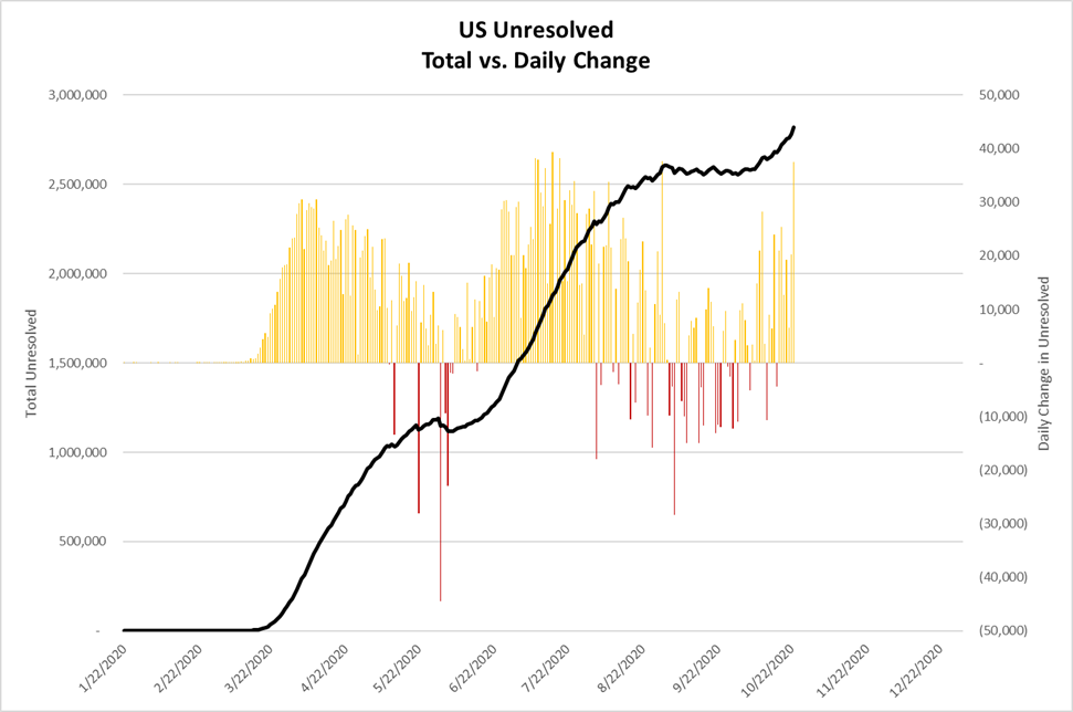
You can see from the chart that in June, for the first time, the number of Unresolved cases (actual sick people on a given day) saw its first decreases, forming a trough which persisted for all of eight days, before returning to positive growth. A second small trough formed for the five days from September 13-17, during which the number of Unresolved cases in the United States actually fell, albeit by only one-tenth of one percent. For the next twenty days, there was zero growth, as the number of people sick in the United States remained essentially unchanged, at roughly 2,575,000. Since October 7, however, that number has grown to 2,819,508.
While it is difficult to see in the chart because the numbers are so close to zero, the extended rolling average growth rate in Unresolved cases in the United States has increased from one-tenth of one percent to five-tenths of one percent over the last 16 days. This is a reflection of the sudden and rapid increase in the number of new cases, which yesterday stood at 81,210, which has not been offset by a similarly great increase in the number of Recoveries or Deaths. This equates to an average daily increase of nearly 15,000 Unresolved cases per day. That’s 15,000 more people sick than the number who either recovered or died each day.
If the growth rate continues to increase, then a mere one percent increase on a base of 3,000,000 Unresolved cases would equal an absolute increase of 30,000 per day. And if we assume that as few as 5 percent of those cases require hospitalization, then we are looking at 1,500 additional hospitalizations per day. I don’t know if I’m reading the reference correctly, but according to https://www.cdc.gov/nchs/data/hus/2017/089.pdf, there were roughly 900,000 total hospital beds in the United States in 2015.
