July 26, 2020, 11:00 am
#stayhomebewell
As the pandemic grows bigger and bigger, my posts are less and less frequent. It feels like it was a speedboat back in March, with quick, sharp turns and fits and starts each day, and so many unknowns that we were monitoring it in real time for weeks on end. Now it is like an enormous ocean liner which takes a long time to make a turn, with colossal movements that take longer to develop, and which you can spot from farther away.
I’m posting today because one of the measures I have been tracking has reached one of those points.
For context, I’ll return to the chart that shows the relative proportions of Unresolved (Active) Cases, Recoveries, and Deaths globally:
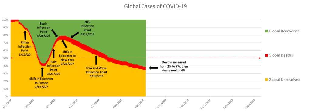
For those who have been following my posts, you’ll see that I’ve extended the timeline (x-axis) out through the end of the year, and I’ve added a dashed line to indicate the 50 percent mark.
I explained how to read this chart on April 29 (https://stayhomebewell.org/2020-04-29/) and May 13 (https://stayhomebewell.org/2020-05-13/).
On April 12 (https://stayhomebewell.org/april-12-2020/), I posted that same chart, as it was at that time:
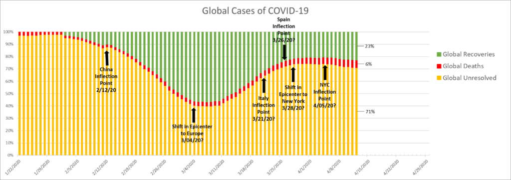
I wrote: “I predict we will see undulations showing an increasing number of Recoveries, as the Unresolved patients in New York join the ranks of the Recovered. The relative portion of Unresolved will decrease for a time, perhaps for another 14-21 days. After that time, the next wave of new cases in New Jersey, Massachusetts, Michigan, and on down the list will swell the ranks of the Unresolved. As each state moves through its disease timeline, the same undulations will occur.”
I went on: “I predict, however, that the waves associated with each of those states, and every state behind them, will grow less and less distinct in terms of the time lags between them. Soon, perhaps within the next 28 days, the entire United States will appear as a single massive wave, and the smaller component waves of each state will become undistinguishable. Furthermore, once the pandemic leaves the flat portion of the exponential growth curve in high-population countries like India, Indonesia, Pakistan, Brazil, Nigeria, etc., the United States will be dwarfed as a portion of the Global total.
“The global low point in the CFR was 2 percent on February 4th and 5th. Fifty-one days later, the US CFR touched its low point of 1.25 percent. This means that there were the greatest number of newly-recorded infections compared to the number of patients who had died. I think that this speaks more to the timing of the course of the disease than to anything else. In the beginning of the pandemic, many people had only just become infected, but had not had time enough for the disease to run its course. With each passing day, more new Cases were recorded, adding to the denominator, and eventually, those who were going to die died. The CFR has increased continually since that time, as the disease conveyor belt, if you will, continues its throughput.
“The hospital system is full of Cases, and those who are going to recover eventually recover, and those who are going to die eventually die. So far, on the Global scale, the More infections continue the throughput, and the CFR, at least with respect to documented Cases, rises to its actual level. We do not know at what level it will top out. Eventually, in theory, when the last new Cases are added to the conveyor belt, those Cases who were roughly 21-28 days old will either recover or die, and the ratio of Deaths to Cases, the CFR, will be at its higest. Supposing we witness the last two cases in this pandemic, and one is Unresolved and the other Dies, then the CFR on that day will be 1/1, or 100 percent. If, on the other hand, one is Unresolved and the other Recovers, then the CFR on that day will be zero percent.
“The global CFR increased by 100 percent, from 2 percent to 4 percent of Cases resulting in deaths over those same 51 days between February 4 and March 22. The US CFR, by contrast, increased from its low of 1.25 percent to the 4 percent level in only 23 days. Over those same 23 days, the Global CFR increased another 50 percent, from 4 percent to 6 percent of all Cases resulting in Deaths. If the past is a guide, the US CFR will increase to 6 percent in less than half the time it took for the Global rate. This would mean that the US CFR will likely increase to 6 percent in roughly 10 days from today, or by April 22. I hope that I am wrong, and we can return in ten days to check the accuracy of this prediction.”
In the event, the US CFR reached 6 percent on May 6, two weeks later than I had projected.
On April 24 (https://stayhomebewell.org/2020-04-23/), I wrote: “The US states of Georgia, Florida, Texas, and several others are at levels of infection and deaths that correspond with where the US as a whole was on March 20. These governors don’t seem to understand that the only thing differentiating their states from New York and New Jersey is time. Nevada is a scant four to eleven days behind them, and the Mayor of Las Vegas seems also to fail to understand.”
Back to the chart above. The proportion of the Recovered, globally, is currently 61 percent, and Unresolved is 35 percent. Note that when the pandemic was shifting from China to Europe, the percentages were at 57 and 40 percent, respectively. I’m going to predict that Recoveries are going to plateau and Unresolved are going to form a bottom in the near future (14-28 days), before they change their trajectories.
Here is another way of viewing that exact same chart:

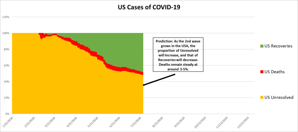
This is the pattern on the global scale. Here is the corresponding chart for the United States:
And the next chart is the reason for my posting today:
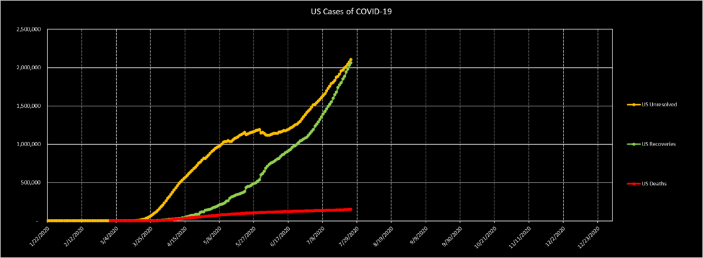
The proportion of Unresolved Cases in the United States has decreased from 100 percent to 48.8 percent today. The proportion of Recoveries has been increasing from zero percent to 47.8 percent today. Those two lines are about to cross.
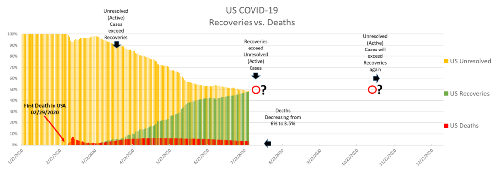
The Unresolved of any given date “D” are the Recoveries and Deaths of date D + Time Period (N), where N = the course of the COVID-19 disease. We see that, whereas the first case in the United States was recorded on January 20 and my timelines begin on January 22, the first death occurred on February 29 (38 days later), and the first recovery was recorded on March 7, or 45 days later. This means that the course of the disease is roughly 40 days. (Nothing biblical there. And the term “quarantine,” I read recently, is derived from the Italian, “quaranta giorni,” or “forty days,” from the length of time arriving ships and sailors were required to isolate before coming ashore in Italy during the time of the Bubonic Plague.)
Here is another way of viewing the same data:
Therefore, today’s new cases will be the recoveries and deaths of 40 days from now. With new infections of roughly 70,000 per day right now, and the current Case Fatality Rate at roughly three percent, that means we can reliably expect 2,100 deaths per day in 40 days, on September 3. If we reach a level of 100,000 new cases per day by August 16 (as I predict below), then we can expect 3,000 deaths per day by October 8. And so on, and so on, until the numbers of new infections are controlled and reduced.
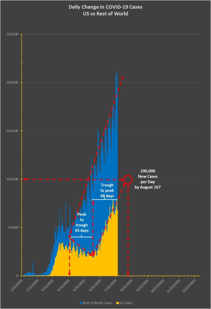
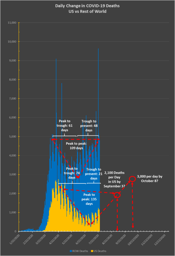
Something changed right around July 2.
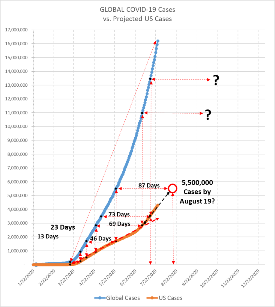
From the start of my projections on March 18, the line describing the growth in Cases in the United States tracked each point in my triangulation model nearly perfectly: April 1, April 10, May 24, and finally July 2. A straight line intersected them all. However, after July 2, the actual Cases began to increase more steeply than that line would have projected, and by July 14 had diverged significantly. Using July 2 and July 14 as my two points of triangulation, the current case trajectory predicts a level of 5,500,000 coronavirus infections in the United States by August 19.
By contrast, the numbers of deaths in the United States has slowed from the projection line in my graph.
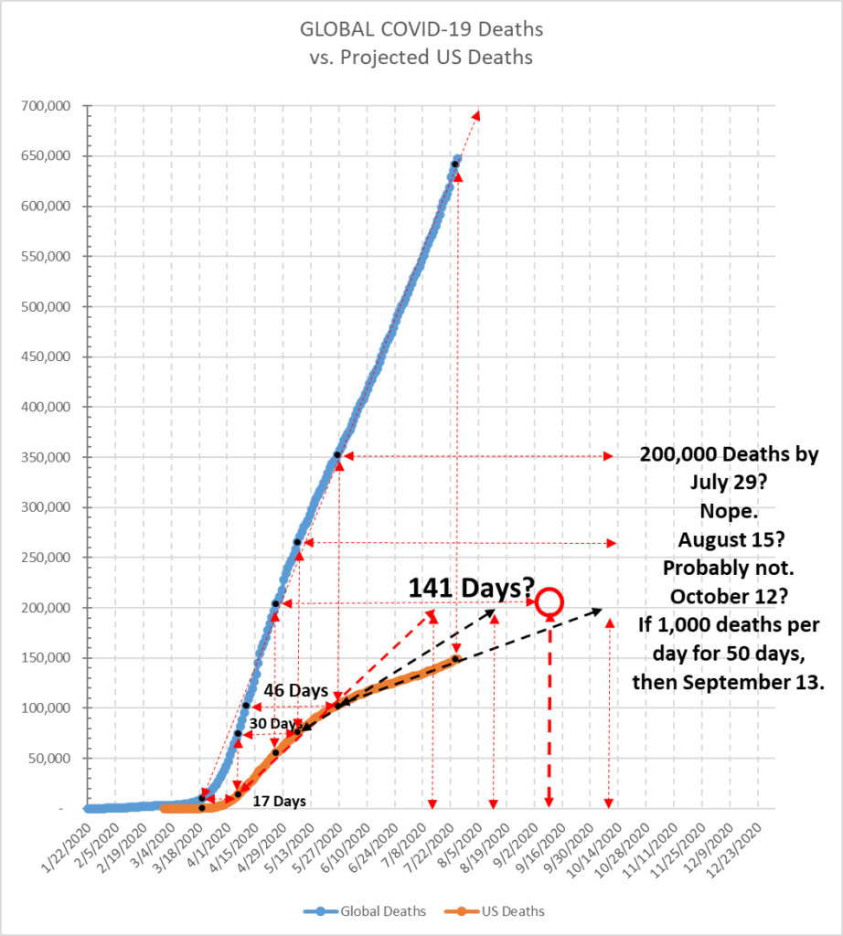
Using my same method of triangulation, the data points from March 19, April 6, April 25 and May 26 were pointing to a level of 200,000 total deaths in the United States by July 29. The number of daily deaths slowed from May 26, however. Thus, if I take the points of April 25 and May 26, the projection pointed to 200,000 by August 15. The two points of May 26 and July 24, however, point to roughly October 12. Because I expect the number of daily deaths to increase in the coming days, however, if I assume an average of 1,000 deaths per day for the next 50 days, then I predict that the US will hit the 200,000 mark around September 13.
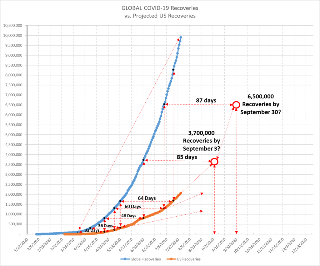
Similarly, but conversely, the reported numbers of recoveries in the United States are increasing faster than a straight line projection would have suggested, which mirrors the reality we see in the global numbers for recoveries as well:
Please be careful. Please wear a mask. Please take this seriously. Please share this information in your networks. I’m not looking for praise or recognition. I’m hoping that my reasoning and my track record will speak for themselves.
One reply on “July 26, 2020”
[…] shift in the Case curve that had taken place on July 2, and which changed the trajectory (see https://stayhomebewell.org/2020-07-26/). My next projected milestone number in that post was 5,500,000 cases, which I projected for August […]