May 13, 2020, 9:30 pm
#stayhomebewell for past, current, and future analysis of the COVID-19 pandemic. www.stayhomebewell.org. and www.facebook.com/stayhomebewell. Instagram and Twitter, too. Please react and share on any platform you use. It still matters what people do.
I’m getting tired. Over the last several weeks, my updates have become less frequent. Partly, I think that’s because I’ve essentially done what it was I set out to do, which was to put out into the world analysis of the daily data that I was not finding elsewhere, with the purpose of trying to demonstrate to any whom I might reach the seriousness of the pandemic in which we all find ourselves.
At this point, people have become inured to the numbers. Ah, I remember the days when my predictions sounded like the ravings of a lunatic, *sigh*, good times, good times… If you peruse the archives of this blog, you’ll see me having predicted a million infections back when we were at just a few thousand… Back when movies cost a nickel and popcorn was a dime, seems like…
Well, I have to post today because May 13 was one of my projection dates. I posted about it numerous times, so I’m not going to rehash it here. On a couple of projections, I was very close. On another I was far from correct. I’ll expose them all to the facts of the day.
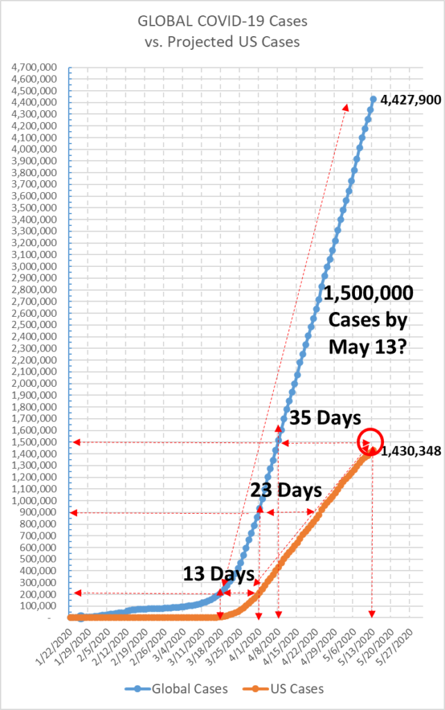
US Cases to Reach 1.5 Million by May 13: I am off by 70,000 cases, or, put another way, by about three or four days. We will reach that number, certainly, just not today. It may be on Saturday or Sunday.
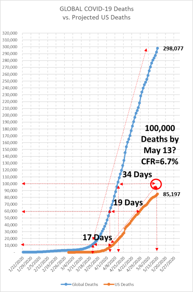
US Deaths to Reach 100,000 by May 13: I was off on this projection by 15,000, or by about seven days. (Oddly enough, my original projection had actually been May 20 (see https://stayhomebewell.org/2020-04-19/). I projected a Case Fatality Rate of 6.7 percent (100,000 deaths / 1,500,000 Cases = 0.067). In fact, the current CFR is 5.96 percent.
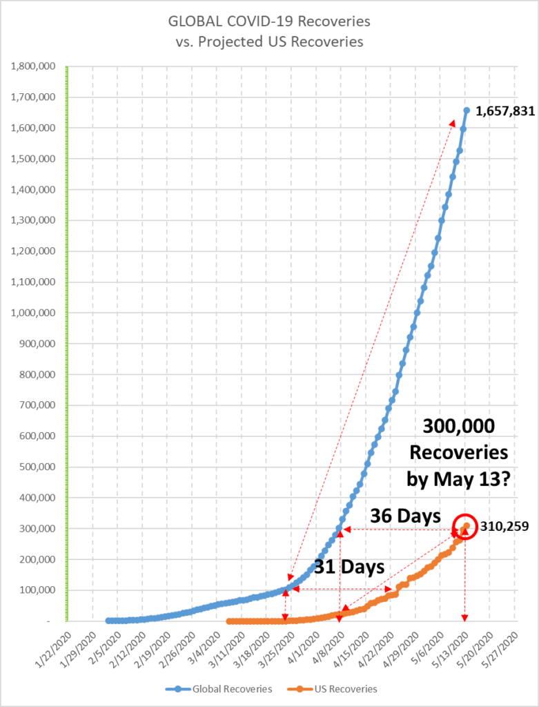
US Recoveries to Reach 300,000 by May 13: The US curve in Recoveries is noticeably flatter than the global curve. I’m not sure, but to me this suggests that the US is doing worse than other countries around the world.
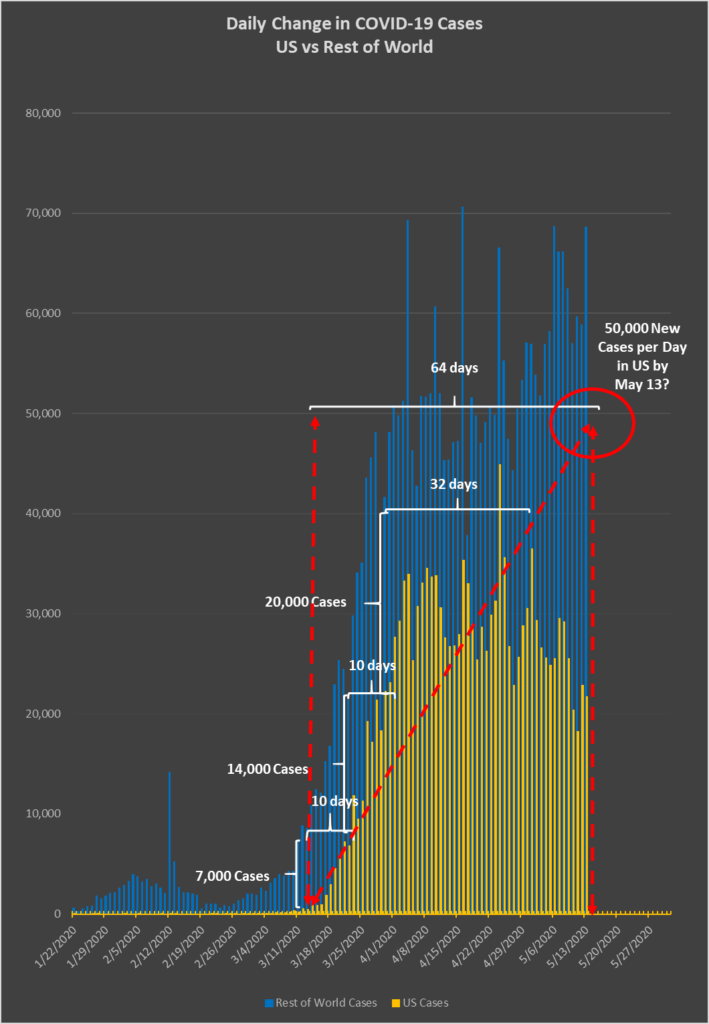
On one measure, the number of New Cases we would see in the United States each day, my projection was clearly off. Based on the assumption that the situation in the United States would be essentially similar to that in the Rest of the World (ROW), I had projected that we would be seeing new infection levels of 50,000 per day. In fact, the average of the last ten days has been just above 24,000, with today’s number being 21,712.
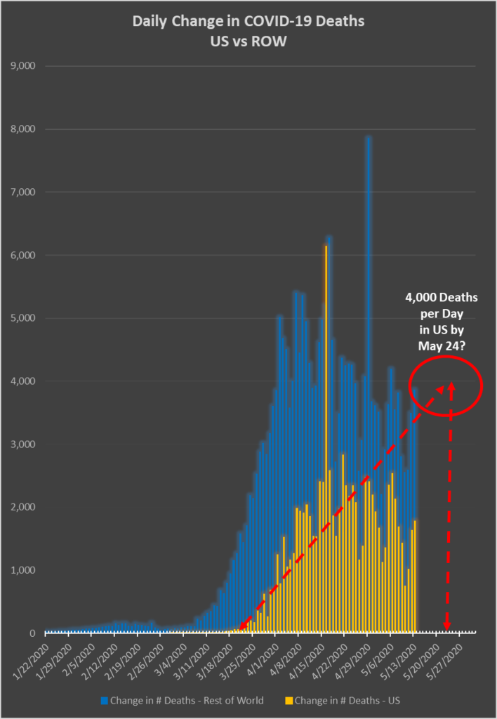
Similarly, I projected that the number of new Deaths per day in the United States would reach 4,000 by eleven days from now, March 24, so that has yet to be seen.
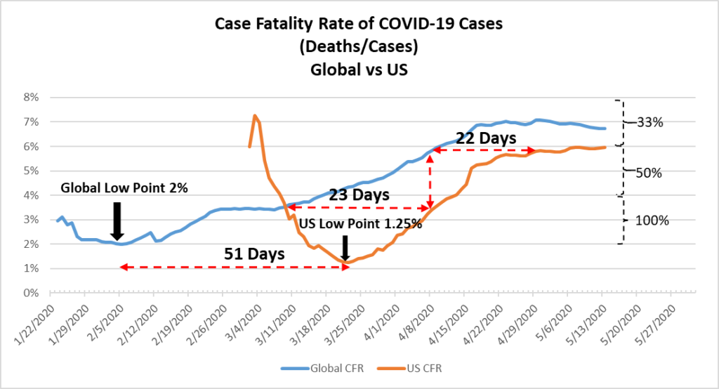
The key variable in all of this is the growth rate in new Cases. The numbers of Deaths and Recoveries are directly derivative of the number of infections. There has been a reliably stable CFR of around 6-7 percent globally and 5-6 percent in the United States over the last four weeks. So there is no mystery there. The only variable is how long it takes for newly infected Americans to either recover or die.
Where there is some uncertainty, is in the growth rate of new infections. This has been the focus of my analysis lo these many weeks.
I identified that the daily growth rates started very high (growth from 1 to 2 is 100 percent, from 2 to 3 is 50 percent, and from 3 to 4 is 33 percent, after all), and then gradually decreased as the base number of cases grew exponentially (from 100,000 to 105,000 is 5 percent, and from 1,000,000 to 1,010,000 is 1 percent). Today, as illustration, the number of new infections in the United States grew from 1,408,636 to 1,430,348, or by 21,712, which is 1.54 percent.
I have also noted that, as the pandemic moves across the globe, the growth rates fall, and rise, and fall again. First there was China, then Italy, then Spain, then New York/New Jersey/Massachusetts; and now we have Chicago, the US meat processing industry, and the prison system. Here is a series of graphs that demonstrate this fact:
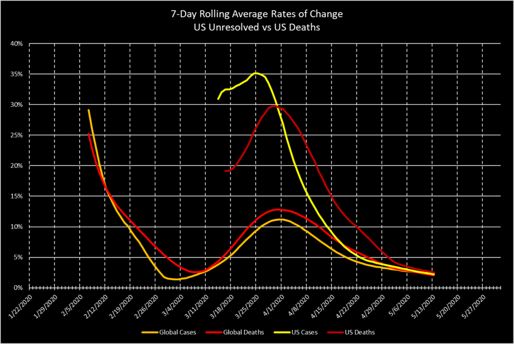
Since the US is currently the global epicenter, the global growth rates and the US growth rates have converged. (Russia and Brazil are currently and tragically surging, and India is not far behind. This will draw the global rates away from the US rates soon. An interesting aside is that Russia, with 10,000 new cases yesterday and a total of 242,000 cases, only had 96 deaths yesterday, for a total of 2,212. This low number merely indicates that Russia’s currently ill patients have not had enough time yet to either recover or die. Wait 30 days and you will see those numbers at vastly higher levels. Also, with the abysmal state of the Russian health care system, I would expect to see a much higher CFR than that in more developed countries.)
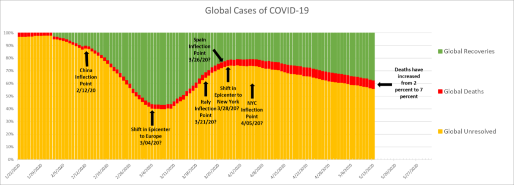
The number of total cases in a country can be broken down into those that are currently ill, or unresolved, and those that have either recovered or died. As I’ve explained in previous posts, as the vast numbers of new infections in China either recovered or died, the number of unresolved decreased. And as the numbers of new infections grew in Italy and Spain, but had not had time yet to either recover or die, the number of unresolved globally grew in proportion. As the pandemic moved from Europe to New York, the same wave pattern developed. Below, however, you can see that the length of the current wave that is forming appears to be much, much greater than those that preceded it in China and Europe. The gentler slope of the New York and rest-of-the-US wave that is forming suggests that its duration will be much greater than were those of China and Europe.
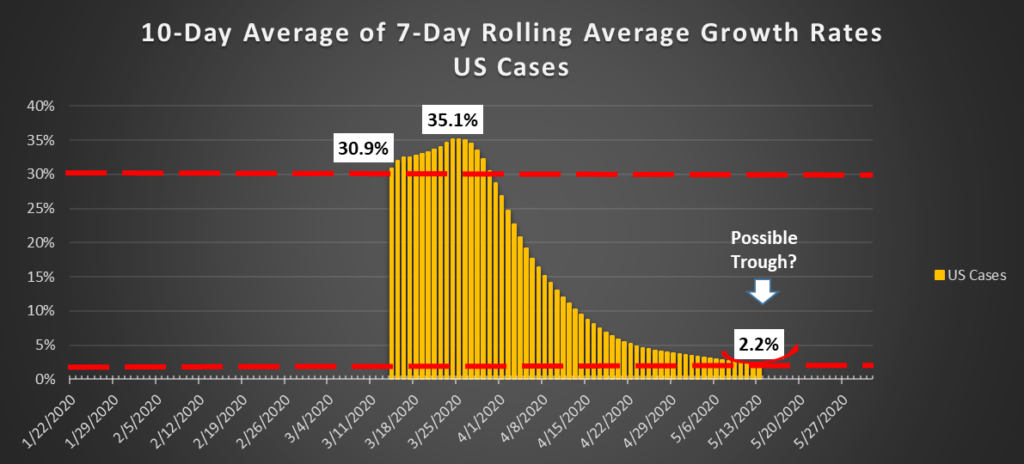
Again, the truly salient issue is the growth rate in new Cases in the United States. I’ve been predicting that the wave in that metric would form a bottom, or a trough, and then would return to increases. This has truly horrific implications, as a 20 percent growth rate over a base of one million cases is 200,000 new cases.
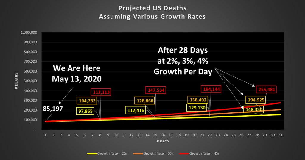
Here are two simple projections that illustrate the point. These are not PREDICTIONS. They are merely illustrations of the mathematics involved, so that you can put the daily news into context. The first chart assumes constant daily growth rates of two, three, or four percent.
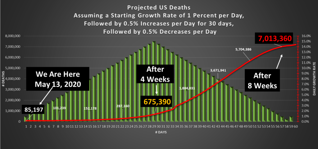
The second assumes a much more aggressive growth rate, starting at one percent and increasing by one half of one percent each day for 30 days to a peak rate of fifteen percent, and then declining by one half of one percent each day for another 30 days, returning to one percent. I repeat, this is NOT a prediction of what will happen; rather, it is merely an illustration of what would happen under this particular set of assumptions.
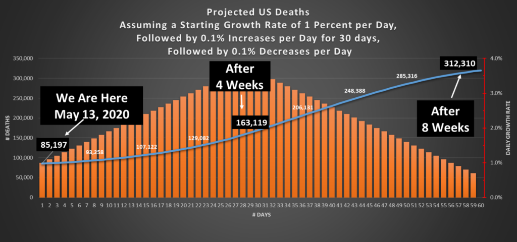
One thing is virtually certain. With more than one million currently unresolved cases in the United States, at a Case Fatality Rate of six percent, 60,000 people will die if even if there is not a single new infection in the country from this moment forward. For every million new infections, we can count on another 60,000 deaths, assuming the CFR does not go up.
I’ll update again when the growth rate curve either proves me right or proves me wrong. Until then, please stay home and be well.
