May 8, 2020, 10:30 pm
#stayhomebewell for past, current, and future analysis of the COVID-19 pandemic. www.stayhomebewell.org. and www.facebook.com/stayhomebewell. Instagram and Twitter, too. Please react and share on any platform you use. It still matters what people do.
The growth rates in all measures are still forming their troughs.
Here is the current state of the projections I made roughly two weeks ago.
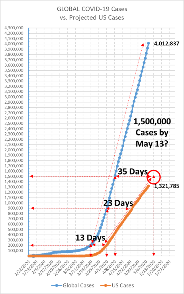
US vs. Global Cases: Readers of this blog will recall that on March 18, the number of cases in the United States was 6,500, but the global total crossed the 200,000 mark (see https://stayhomebewell.org/2020-03-18-pascals-wager-meets-the-prisoners-dilemma/). On that date, I projected that the US would reach 67,000 cases by April 15. As the days passed, however, reality was moving faster than my projection, and I revised upward several times, up to 80,000 cases on March 20; up to 200,000 cases on March 28 (see https://stayhomebewell.org/2020-03-28/); up to 400,000 cases on March 31 (see https://stayhomebewell.org/2020-03-31/); up to 500,000 cases on April 2 (see https://stayhomebewell.org/2020-04-02/); and, after under-shooting the mark fully three times, I finally overshot the mark on April 10 (https://stayhomebewell.org/april-10-2020/), by revising my projection up to 750,000 cases.
In fact, on April 15, the US reached 640,000. It was April 19 that we reached 750,000.
Back to March 18: It was 13 days later, on March 31, that the US reached the 200,000 cases milestone. On that date, the global number was approaching 900,000. The US reached that same milestone 23 days later, on April 23. Those two dates, March 31 and April 23, served to form the two points of a line which, if nothing were to change, would point to a level of 1,500,000 cases in the US by May 13. Each day since then, I’ve been filling in the dots:

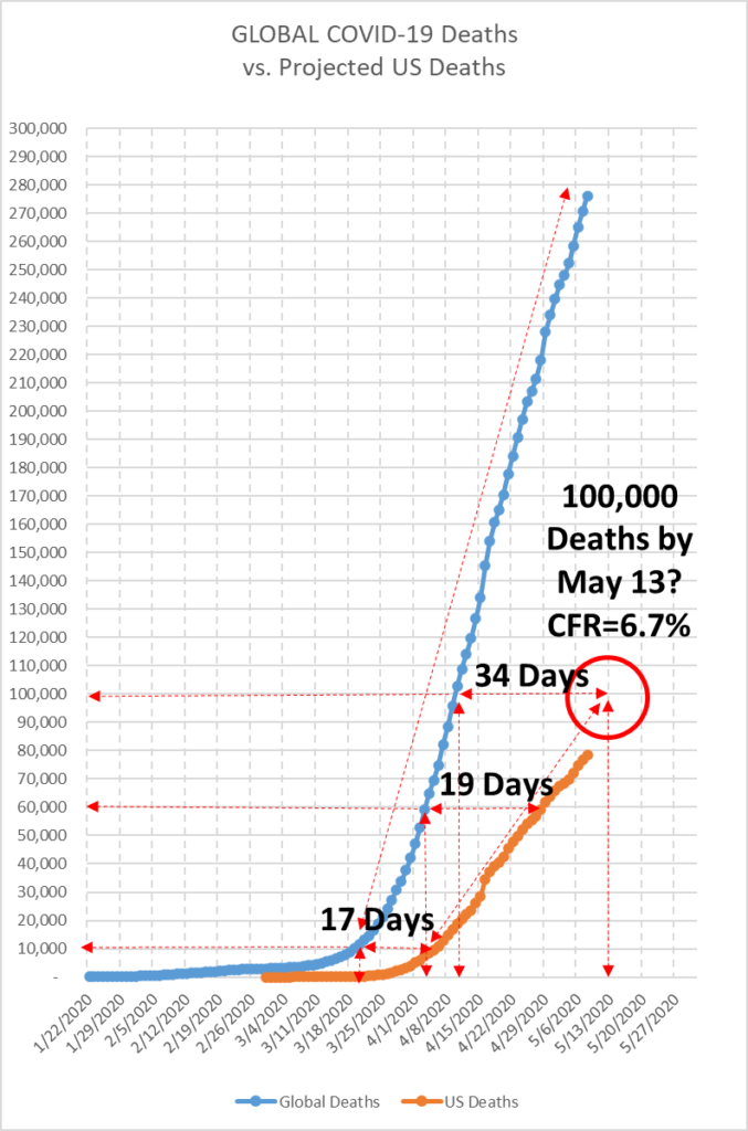
I used the same methodology with respect to deaths. On March 19, the US was at 200 and the world had reached 10,000. The US reached 10,000 on April 5, by which date the global total had reached 60,000. The global total reached 100,000 on April 10, when the US was only approaching 19,0000. The US would not reach 60,000 until April 29, but the triangulation method as early as April 10 projected 100,000 deaths in the US by May 13.

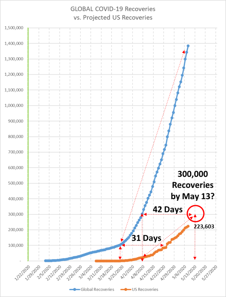
The same methodology yields a projection of 300,000 recoveries in the United States by the same date, May 13.

You can see that the shapes of the three curves – Cases, Deaths, and Recoveries – are virtually identical on the global charts. The only thing that differs is the scale, but the J-shaped, or hockey-stick-shaped curves are entirely consistent across metrics. This signifies that the proportions of deaths and recoveries have remained consistent throughout the course of the pandemic, with a Case Fatality Rate of approximately seven percent.
The corresponding curves for the United States are also consistent among the three metrics, but the angle of increase is somewhat flatter than the angle of the global curves. This may be a representation of the effectiveness of US efforts to “flatten the curve” over the last six weeks.
However, I note that the Recovery curve in the US is flatter than the Cases and Deaths curves are, which I take as a discouraging indicator, as it suggests that the US is somehow doing worse than the rest of the world has been doing with respect to patients recovering from COVID-19.
Finally, I take one more very disheartening inference from these graphs. We can see that the global curves have just gone up and up and up unabated. Of course, this represents country after country joining the ranks that contribute to those numbers, after China, Iran, Italy, Spain, and the US. However, there has been nothing in the United States, no new development, breakthrough, vaccine, or anything that would suggest that our curve will not also follow an unabated upward trajectory. Quite the contrary, in my estimation, the US government and populace has made mistake after mistake in its handling of this situation.
Furthermore, if you’ve been following this blog, you know that I have been focused almost exclusively on analysis of the growth rates of these curves, and that my primary finding has been that the growth rates appear to rise and fall in waves. I have been projecting for several weeks that we would see a valley, or trough, forming in the daily growth rates, after which they would return to a 30- to 35-day period of increasing growth. I believe that the valleys are forming now. This means that in the coming days, we will see the daily numbers of new cases rise to levels of 40,000-50,000 per day, and deaths rising to levels of 3,000-6,000 per day very soon. God help us all.
