April 3, 2020, 11:45 pm
#stayhomebewell for updates
Thank you for visiting this site. I began looking at the data that was being compiled by Avi Schiffman’s site, https://ncov2019.live/data, on March 11. While it was a tremendous thing he had built, and an invaluable service to the world he had provided, I wanted to know more than just what the current totals were at a given moment. I wanted to know what had happened the previous day, and historically further back, in order to try to make sense of what those totals meant. I pulled my kids out of school.
I built an Excel spreadsheet and manually entered them into my emergent dashboard, so I could plot the curves. Just three numbers: Cases, Deaths, and Recoveries. March 11. March 12. March 13. Then I started calculating ratios. Then I started making inferences and projecting scenarios based on varying assumptions. The schools announced they would be closing for two weeks.
I don’t know how to write a program to crawl the web and scrape data, automate a dashboard, build a website, or to do much of anything like it, for that matter. But I know how to divide B by A and make a new column, C, and then graph the results and scratch my head. The picture that emerged was absolutely horrific, and I could not believe what I was seeing. The levels of infection and death that the graphs predicted were shocking. And I could not adjust my mindset to accept what the numbers on the screen were saying.
I filled in the numbers on March 12, March 13, and March 14, and realized I needed to find the source data that had the totals recorded for each day from the beginning of this pandemic, in order to put those days’ data points into context. I found it somewhere in the obscure links behind one of the sites, can’t remember where. That was even more shocking, as it demonstrated clearly that the rates of infection and death were both consistent, and exponential.
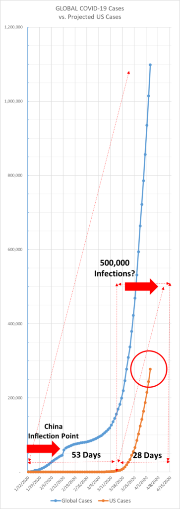
On March 15, I plotted my first projection. Taking the curve of the global cases, overlaying a simple straight line as a crude a trend line, and then making a parallel copy of that line 53 days further into the future gave me my first glimpse of what could be in store for the United States. At that time, we had 3,400 cases and 63 deaths, and my projection was that by the end of March we would be at 40,000 cases and 800 deaths. I began to tell my close friends and they looked at me like I was Chicken Little.
As I’ve remarked before, those numbers seem quaint now. On March 31, the US had 183,347 cases and 3,860 deaths. The ratio of deaths to cases was correct, though: I had assumed two percent (800/40,000 = 0.02), and 3,860/183,347 = 0.026. What I had underestimated by 7 days, however, was the speed at which the virus would spread. The 40,000 case mark was reached on March 23.
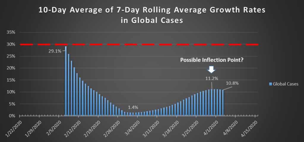
Global Cases: up 8.3 percent, or nearly 84,500 new cases today, to a total of just under 1,100,000. The extended rolling average growth rate appears to have reached a possible inflection point on March 30, where it stood at 11.2 percent for three days straight, whereas today’s rate is lower at 10.8 percent. Perhaps this suggests that Italy or Iran have passed through their respective apexes. I am not looking closely at country-by-country data, but this change in the metrics that I am tracking may provide clues to those who are.
Global Deaths: up 11.7 percent, or just under 6,200 dead people today, to 59,175.
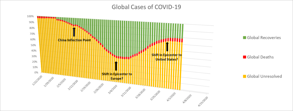
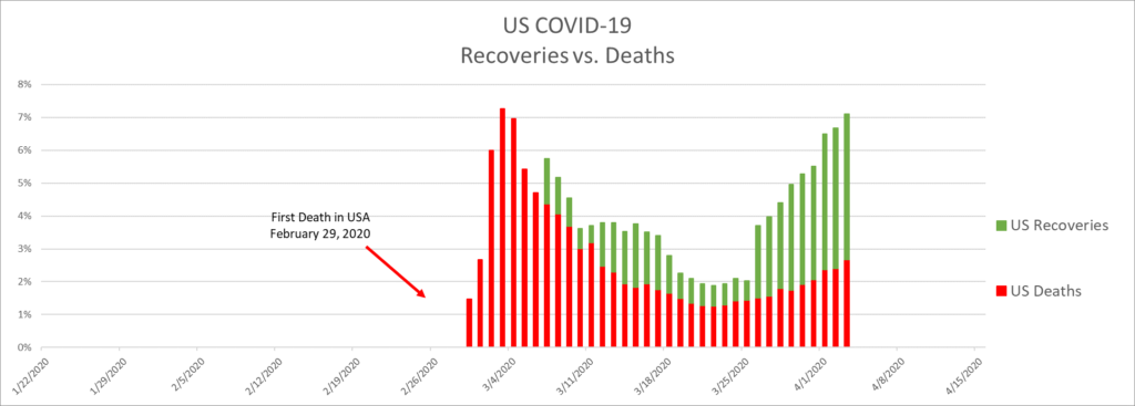
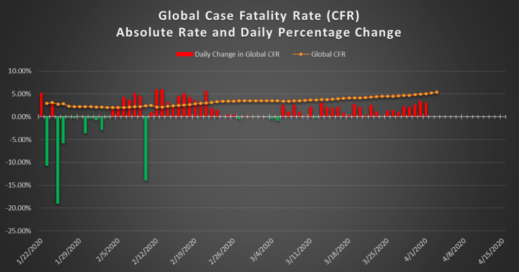
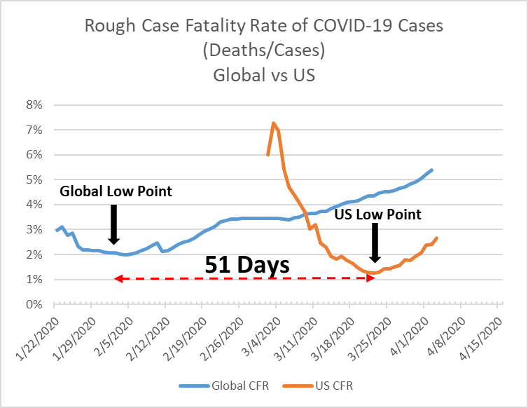
Those two figures yield a CFR of 5.4 percent, which is frighteningly high. The global CFR has been growing since February 4 (see the post from yesterday, April 2) and grew by 3 percent today. I’ve colored the positive growth bars red, since growth in the CFR is alarming, and negative growth bars green.
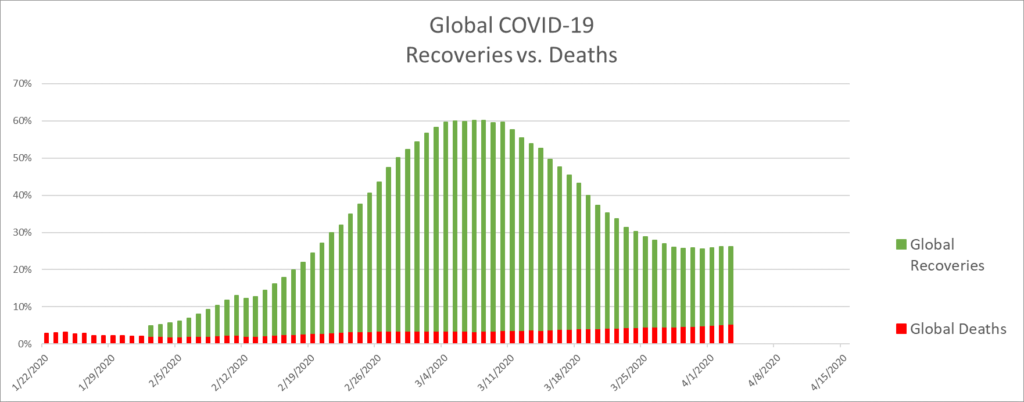
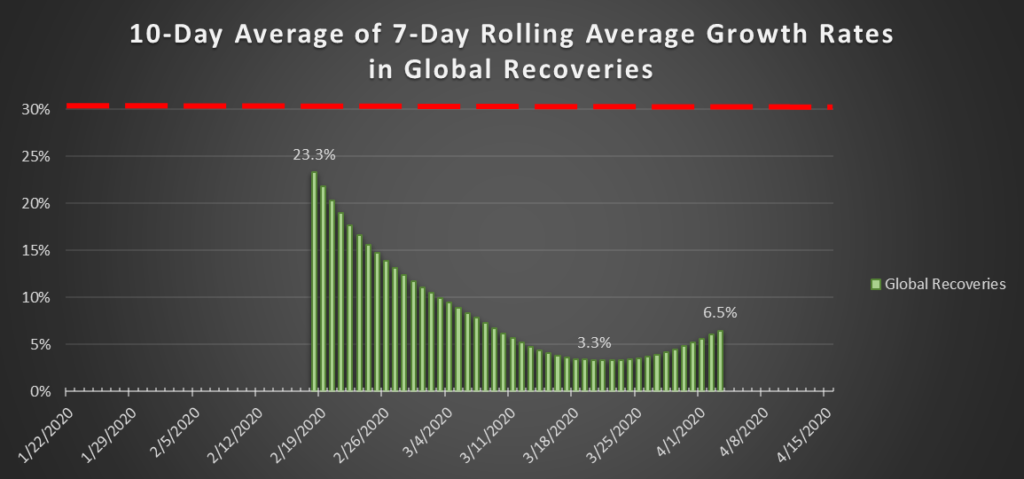
Global Recoveries: I’m going to change my terminology here, I think. It is tautological to say that “recoveries are up.” A single recovery is an increase, and anything that is not a recovery is a death. So, until we are through this entire pandemic, there will always be new recoveries each day. What matters is the rate of growth. I’ll still give the numbers, but the growth rate is the headline.
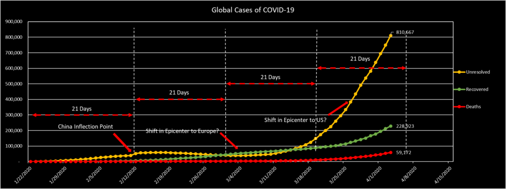
Today, 16,900 people recovered from COVID-19. That number represents 8 percent of yesterday’s cumulative total of 212,000, bringing the total recoveries worldwide up to 229,000. The previous day’s percentage was higher, though, at 9.3 percent. At first glance, this would appear to be a negative development, as we want the recovery rate to be increasing at an increasing rate, and today’s rate increased less than yesterday’s. The extended rolling average, however, still shows an upward trend.
Global Unresolved: There are 810,667 people around the world who are documented as infected with COVID-19. I do not know how that statistic is measured. I assume that everyone who has been tested and simply sent home to self-isolate, like both Rand Paul and Chris Cuomo, are included in that number. We have no idea how many people are home sick and do not know whether they have COVID-19 or just some other flu, cold, or sore throat. From what I can tell, the chances are good that the number is orders of magnitude greater than this headline number. Eight million? Eighty million? Eight-hundred million? I don’t think anyone knows.
I think it’s never an inappropriate time to mention that I don’t know anything about epidemiology or medicine. Just an excel spreadsheet and a curious mind is enough to tell me that two plus two equals fucked.
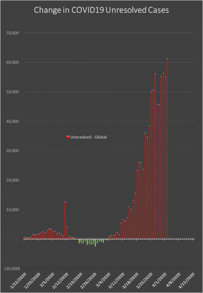
The number of Unresolved increased by more than 61,000 today. Those 61,000 were 8.2 percent of the previous day’s total. And that 8.2 percent was greater than the previous day’s 7.95 percent.
I believe that this graph is the one that will tell us when we have reached the apex of the pandemic curve. Notice that between February 18 and March 4, the daily changes were in the negative. This is the indicator that more people are leaving the hospitals (either in body bags or on their own two feet) than are going in. Recall from earlier posts and graphs that the inflection point in China occurred on February 12 with a high water mark of some 14,000 new cases, and by early March the daily new case numbers were in the tens, not the thousands. The move to the positive on March 7 appears to correspond to the shift in the epicenter to Europe I noted as appearing on March 4 in the various graphs of Global Cases. Hopefully, we this graph will enable us to identify when the United States has reached its apex in real time, as it will show a negative number on the very day the balance tips.
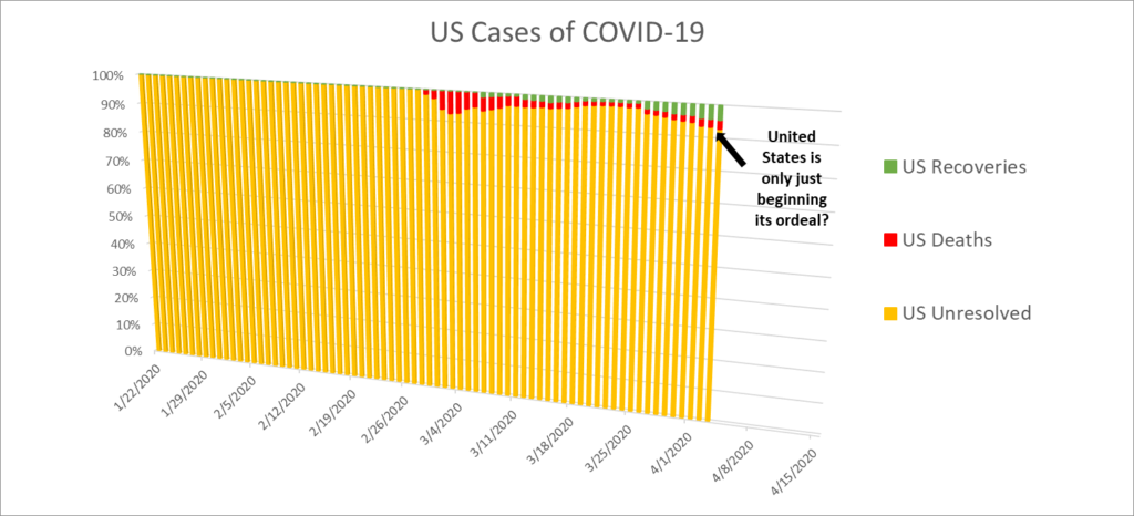
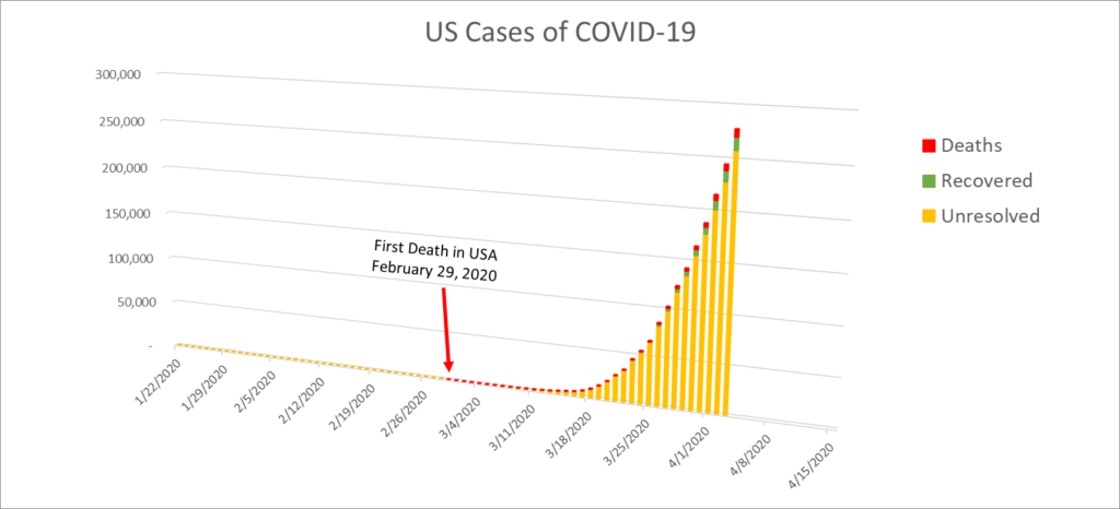
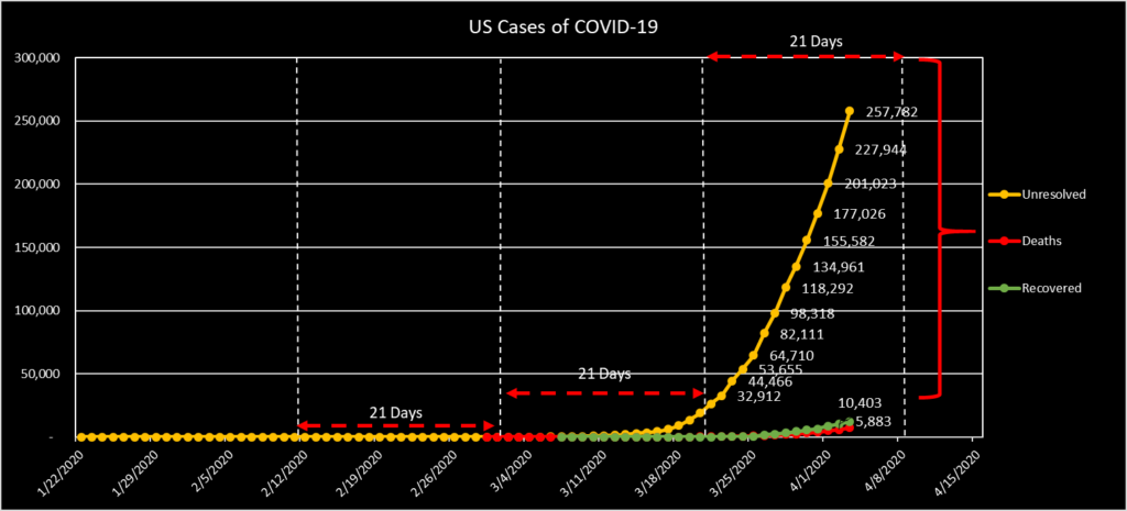
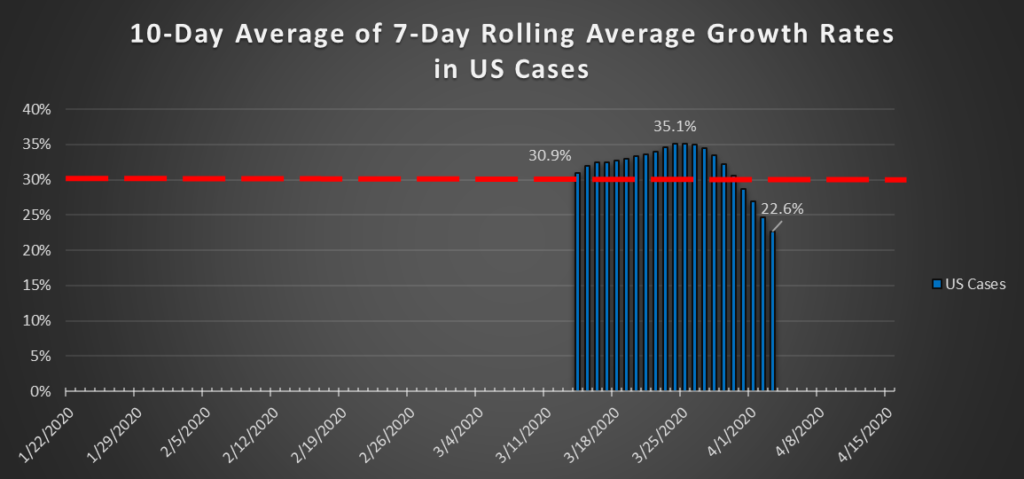
US Cases: up 13.6 percent, or 33,200 new infections today, to a total of 277,500. The extended rolling average rate of growth in this metric has also shown a sustained reduction since March 24, when it peaked at 35.1 percent. Today’s figure was 22.6 percent, the ninth day of consistent decrease. Perhaps this is an indicator of where New York City is in its curve. My expectation is that we will see undulations in this metric as the epicenters move from city to city.
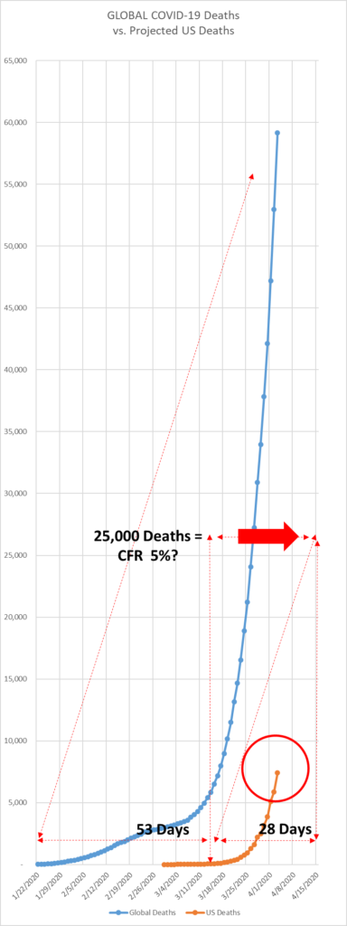
US Deaths: up 25.8 percent yesterday. 1,519 people died yesterday (at least, according to the time that I marked the number for the day), bringing the total US death toll to 7,402.
The Case Fatality Rate (CFR) grew by nearly 11 percent from yesterday, to 2.67 percent today.
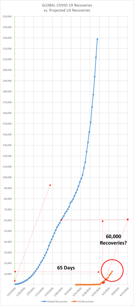
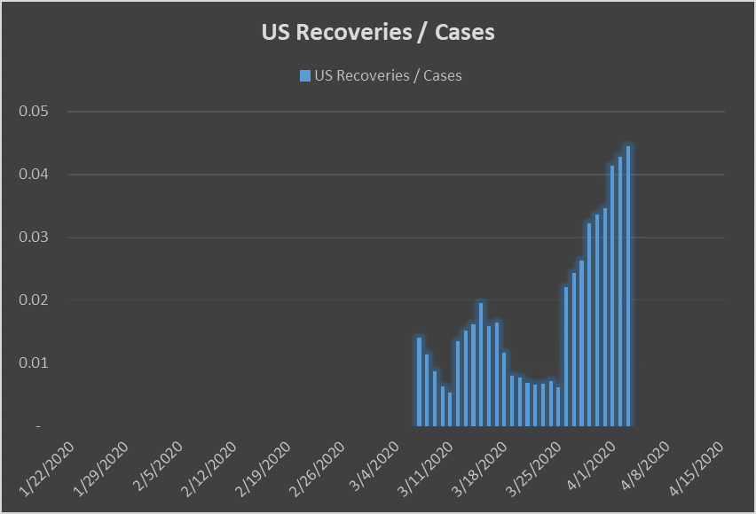
US Recoveries: up 18 percent, or 1,880, to 12,283. The ratio of Recoveries to Cases is the highest it has been to date, having increased steadily since March 25. By contrast, however, the same measure for the Global Recoveries is on a scale that is one order of magnitude higher.
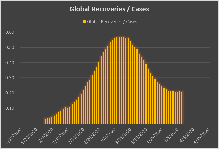
Without further commentary, here are the charts you’ve come to know, so you can watch them develop in real time.
